
As you know that the Front-end-development language (HTML, CSS, and JAVASCRIPT) are very cool to make any type of modern, impressive and make more attractive Submit or Send Button.
So, In this video, you can see 20 Modern Submit and Send Button.
Let’s get Started…
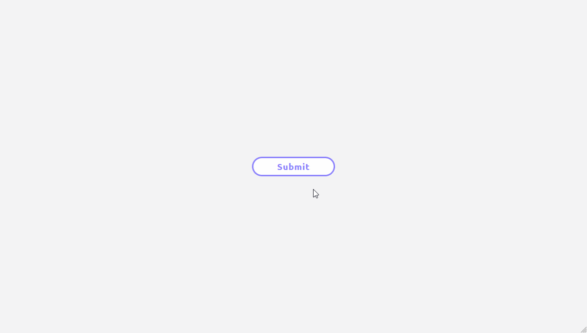
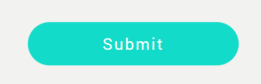
1. SUBMIT BUTTON
Submit status button with a mixture of SVG, CSS and little bit of ES6.
Made with
HTML / CSS / JavaScript
HTML [wp-svg-icons icon=”html5″ wrap=”i”]
<div class="wrapper">
  <button class="">
    <span>Submit</span>
    <div class="success">
    <svg xmlns:xlink="http://www.w3.org/1999/xlink" version="1.1"  viewBox="0 0 29.756 29.756" style="enable-background:new 0 0 29.756 29.756;" xml:space="preserve">

	<path d="M29.049,5.009L28.19,4.151c-0.943-0.945-2.488-0.945-3.434,0L10.172,18.737l-5.175-5.173   c-0.943-0.944-2.489-0.944-3.432,0.001l-0.858,0.857c-0.943,0.944-0.943,2.489,0,3.433l7.744,7.752   c0.944,0.943,2.489,0.943,3.433,0L29.049,8.442C29.991,7.498,29.991,5.953,29.049,5.009z"/>
 </svg>
      </div>
  </button>
</div>
CSS [wp-svg-icons icon=”css3″ wrap=”i”]
body{
  background: #f4f4f4;
  height: 100vh;
}

.wrapper{
  position: relative;
  width: 100%;
  height: 100%;
}

button{
  font-family: 'Ubuntu', sans-serif;
  position: absolute;
  top: 50%;
  left: 50%;
  transform: translate(-50%, -50%);

  width: 170px;
  height: 40px;
  line-height: 1;
  font-size: 18px;
  font-weight: bold;
  letter-spacing: 1px;
  border: 3px solid #8C82FC;
  background: #fff;
  color: #8C82FC;
  border-radius: 40px;
  cursor: pointer;
  overflow: hidden;
  transition: all .35s;
}

button:hover{
  background: #8C82FC;
  color: #fff;
}

button span{
  opacity: 1;
  visibility: visible;
  transition: all .35s;
}

.success{
  position: absolute;
  top: 0;
  left: 0;
  width: 100%;
  height: 100%;
  background: #fff;
  border-radius: 50%;
  z-index: 1;
  opacity: 0;
  visibility: hidden;
  transition: all .35s;
}

.success svg{
  width: 20px;
  height: 20px;
  fill: yellowgreen;
  transform-origin: 50% 50%;
  transform: translateY(-50%) rotate(0deg) scale(0);
  transition: all .35s;
}

button.is_active{
  width: 40px;
  height: 40px;
}

button.is_active .success{
  opacity: 1;
  visibility: visible;
}

button.is_active .success svg{
  margin-top: 50%;
  transform: translateY(-50%) rotate(720deg) scale(1);
}

button.is_active span{
  opacity: 0;
  visibility: hidden;
}
JAVASCRIPT
let btn = document.querySelector("button");

btn.addEventListener("click", active);

function active() {
  btn.classList.toggle("is_active");
}
2. SEND BUTTON TRANSFORMS INTO BIRDS
A CSS animation of a send button transforming into flying birds when clicked.
Made with
HTML / CSS (SCSS) / JS
HTML [wp-svg-icons icon=”html5″ wrap=”i”]
<div class="wrapper-no4">
    <button class="button-bird">
        <p class="button-bird__text">SEND</p>
        <svg version="1.1" class="feather" xmlns="http://www.w3.org/2000/svg" xmlns:xlink="http://www.w3.org/1999/xlink" x="0px" y="0px"
             viewBox="0 0 75 38" style="enable-background:new 0 0 75 38;" xml:space="preserve">
        <g>
            <path d="M20.8,31.6c3.1-0.7,2.9-2.3,2,1c9.1,4.4,20.4,3.7,29.1-0.8l0,0c0.7-2.1,1-3.9,1-3.9c0.6,0.8,0.8,1.7,1,2.9
                c4.1-2.3,7.6-5.3,10.2-8.3c0.4-2.2,0.4-4,0.4-4.1c0.6,0.4,0.9,1.2,1.2,2.1c4.5-6.1,5.4-11.2,3.7-13.5c1.1-2.6,1.6-5.4,1.2-7.7
                c-0.5,2.4-1.2,4.7-2.1,7.1c-5.8,11.5-16.9,21.9-30.3,25.3c13-4,23.6-14.4,29.1-25.6C62.8,9,55.6,16.5,44.7,20.7
                c2.1,0.7,3.5,1.1,3.5,1.6c-0.1,0.4-1.3,0.6-3.2,0.4c-7-0.9-7.1,1.2-16,1.5c1,1.3,2,2.5,3.1,3.6c-1.9-0.9-3.8-2.2-5.6-3.6
                c-0.9,0.1-10.3,4.9-22.6-12.3C5.9,17.7,11.8,26.9,20.8,31.6z"/>
        </g>
        </svg>
        <span class="bird"></span>
        <span class="bird--1"></span>
        <span class="bird--2"></span>
        <span class="bird--3"></span>
        <span class="bird--4"></span>
        <span class="bird--5"></span>
        <span class="bird--6"></span>
        <span class="bird--7"></span>
        <span class="bird--8"></span>
        <span class="bird--9"></span>
        <span class="bird--10"></span>
        <span class="bird--11"></span>
        <span class="bird--12"></span>
        <span class="bird--13"></span>
        <span class="bird--14"></span>
        <span class="bird--15"></span>
        <span class="bird--16"></span>
        <span class="bird--17"></span>
        <span class="bird--18"></span>
        <span class="bird--19"></span>
        <span class="bird--20"></span>
        <span class="bird--21"></span>
        <span class="bird--22"></span>
        <span class="bird--23"></span>
        <span class="bird--24"></span>
        <span class="bird--25"></span>
        <span class="bird--26"></span>
        <span class="bird--27"></span>
        <span class="bird--28"></span>
        <span class="bird--29"></span>
        <span class="bird--30"></span>
    </button>
 </div>
CSS [wp-svg-icons icon=”css3″ wrap=”i”]
$sizeh4: 25px;
$sizew4: 59px;
$sizew4fore: 118px;
$color4: #131335;
$color4Blue: #BEEDFF;
$widthBird2: 60px;
$widthBird1: 30px;
$heightBird2: 33px;

body{
	margin: 0;
	padding: 0;
	overflow-x:hidden;
}
.wrapper-no4 {
	display: flex;
	justify-content: center;
	align-items: center;
	background: linear-gradient(to bottom, $color4Blue, white);
	height: 100vh;
	width: 100vw;
	max-width:100%;
	overflow: hidden;

	.button-bird{
		width: 300px;
		height: 88px;
		background-color: $color4;
		border-radius: 5px;
		position: absolute;
		top: 50%;
		opacity: 1;
		transform: translateY(-50%);
		padding: 0;
		border: none;
		display: flex;
		justify-content: center;

		&__text{
			text-align: center;
			font-size: 20px;
			font-family: Helvetica, Arial, sans-serif;
			color: $color4Blue;
			position: absolute;
			z-index: 1000;
			top: 50%;
			margin: 0;
			transform: translateY(-50%);
		}
		&:focus {
		  outline: none;
		}
		&:hover{
			.bird--30{
				left: 600px;
				top: -550px;
				opacity: 0;
				transition: left 1.5s cubic-bezier(0.42, 0, 0.58, 1), top 1.5s cubic-bezier(0.42, 0, 0.58, 1), opacity 0.5s linear 1s;
			}
			.bird--30:after{
				left: 50px;
				top: 50px;
				transition: all 1.5s cubic-bezier(0.42, 0, 0.58, 1) -0.5s;
			}
			.bird--30:before{
				left: -50px;
				top: 50px;
				transition: all 1.5s cubic-bezier(0.42, 0, 0.58, 1) -0.5s;
			}
		}

		.feather{
			position: absolute;
			width: 18%;
			left: 40%;
			top: 12px;
			display: none;
			opacity: 0;
			fill: $color4;
		}
	}

	.button-bird.active {
		background-color: transparent;
		transition: all 0.2s linear 0.1s;

		.button-bird__text{
			color: $color4;
			animation: text-fade 1.5s 0.2s;
		}
		.feather{
			display: block;
			animation: feather-fade 1.5s linear 0.5s forwards;
		}
		.bird--20,
		.bird--19,
		.bird--18,
		.bird--21,
		.bird--23,
		.bird--25,
		.bird--30{
			left: 600px;
			top: -550px;
			opacity: 0;
			transition: left 2s cubic-bezier(0.42, 0, 0.58, 1), top 2s cubic-bezier(0.42, 0, 0.58, 1), opacity 0.5s linear 1.5s;
		}
		.bird--5,
		.bird--17,
		.bird--16,
		.bird--15,
		.bird--22{
			left: 600px;
			top: -600px;
			opacity: 0;
			transition: left 2s cubic-bezier(0.42, 0, 0.58, 1) 0.1s, top 2s cubic-bezier(0.42, 0, 0.58, 1) 0.1s, opacity 0.5s linear 1.6s;
		}
		.bird--14,
		.bird--13,
		.bird--12,
		.bird--24,
		.bird--1{
			left: 650px;
			top: -650px;
			opacity: 0;
			transition: left 2s cubic-bezier(0.42, 0, 0.58, 1) 0.15s, top 2s cubic-bezier(0.42, 0, 0.58, 1) 0.15s, opacity 0.5s linear 1.65s;
		}
		.bird--11,
		.bird--10,
		.bird--9,
		.bird--26,
		.bird--27{
			left: 650px;
			top: -700px;
			opacity: 0;
			transition: left 2s cubic-bezier(0.42, 0, 0.58, 1) 0.2s, top 2s cubic-bezier(0.42, 0, 0.58, 1) 0.2s, opacity 0.5s linear 1.7s;
		}
		.bird--8,
		.bird--7,
		.bird--6,
		.bird--28{
			left: 700px;
			top: -750px;
			opacity: 0;
			transition: left 2s cubic-bezier(0.42, 0, 0.58, 1) 0.25s, top 2s cubic-bezier(0.42, 0, 0.58, 1) 0.25s, opacity 0.5s linear 1.75s;
		}
		.bird,
		.bird--4,
		.bird--29,
		.bird--3{
			left: 750px;
			top: -800px;
			opacity: 0;
			transition: left 2s cubic-bezier(0.42, 0, 0.58, 1) 0.3s, top 2s cubic-bezier(0.42, 0, 0.58, 1) 0.3s, opacity 0.5s linear 1.8s;
		}
		.bird--2{
			left: 850px;
			top: -850px;
			opacity: 0;
			transition: left 1.5s cubic-bezier(0.42, 0, 0.58, 1) 0.35s, top 1.5s cubic-bezier(0.42, 0, 0.58, 1) 0.35s, opacity 0.5s linear 1.8s;
		}
		.bird--5:after,
		.bird--4:after,
		.bird--8:after,
		.bird--14:before,
		.bird--16:after,
		.bird--17:before,
		.bird--21:after,
		.bird--30:after,
		.bird--30:before{
			left: 50px;
			top: -100px;
			transition: all 1s cubic-bezier(0.42, 0, 0.58, 1) -0.3s;
		}
		.bird--4:before,
		.bird--7:before,
		.bird--9:after,
		.bird--12:before,
		.bird--13:before,
		.bird--18:after,
		.bird--27:after,
		.bird--26:before{
			left: -50px;
			top: 0px;
			transition: all ss cubic-bezier(0.42, 0, 0.58, 1) -0.5s;
		}
		.bird:before,
		.bird--2:after,
		.bird--1:after,
		.bird--7:after,
		.bird--8:before,
		.bird--15:after,
		.bird--19:before,
		.bird--22:after,
		.bird--28:after,
		.bird--28:before,
		.bird--3:after{
			left: 100px;
			top: -100px;
			transition: all 1s cubic-bezier(0.42, 0, 0.58, 1) 0s;
		}
		.bird--2:before,
		.bird--1:before,
		.bird--9:before,
		.bird--12:after,
		.bird--13:after,
		.bird--17:after,
		.bird--19:before,
		.bird--23:after,
		.bird--23:before{
			left: 50px;
			top: -10px;
			transition: all 2s cubic-bezier(0.42, 0, 0.58, 1) -0.5s;
		}
		.bird:after,
		.bird--6:before,
		.bird--10:after,
		.bird--11:after,
		.bird--16:before,
		.bird--18:before,
		.bird--20:before,
		.bird--24:before,
		.bird--26:after,
		.bird--27:before{
			left: 50px;
			top: 50px;
			transition: all 2s cubic-bezier(0.42, 0, 0.58, 1) -0.5s;
		}
		.bird--3:before,
		.bird--6:after,
		.bird--10:before,
		.bird--11:before,
		.bird--14:after,
		.bird--15:before,
		.bird--20:after,
		.bird--22:before,
		.bird--24:after,
		.bird--25:after,
		.bird--25:before,
		.bird--5:before{
			left: 100px;
			top: -10px;
			transition: all 2s cubic-bezier(0.42, 0, 0.58, 1) -0.5s;
		}

	}

	//size of two birds
	.bird,
	.bird:before,
	.bird:after,
	.bird--1,
	.bird--1:after,
	.bird--1:before,
	.bird--2,
	.bird--2:after,
	.bird--2:before,
	.bird--3,
	.bird--3:after,
	.bird--3:before,
	.bird--4,
	.bird--4:after,
	.bird--4:before,
	.bird--5,
	.bird--5:after,
	.bird--5:before,
	.bird--6,
	.bird--6:after,
	.bird--6:before,
	.bird--7,
	.bird--7:after,
	.bird--7:before,
	.bird--8,
	.bird--8:after,
	.bird--8:before,
	.bird--9,
	.bird--9:after,
	.bird--9:before,
	.bird--10,
	.bird--10:after,
	.bird--10:before,
	.bird--11,
	.bird--11:after,
	.bird--11:before,
	.bird--12,
	.bird--12:after,
	.bird--12:before,
	.bird--13,
	.bird--13:after,
	.bird--13:before,
	.bird--14,
	.bird--14:after,
	.bird--14:before,
	.bird--15,
	.bird--15:after,
	.bird--15:before,
	.bird--16,
	.bird--16:after,
	.bird--16:before,
	.bird--17,
	.bird--17:after,
	.bird--17:before,
	.bird--18,
	.bird--18:after,
	.bird--18:before,
	.bird--19,
	.bird--19:after,
	.bird--19:before,
	.bird--20,
	.bird--20:after,
	.bird--20:before,
	.bird--21,
	.bird--21:after,
	.bird--21:before,
	.bird--22,
	.bird--22:after,
	.bird--22:before,
	.bird--23,
	.bird--23:after,
	.bird--23:before,
	.bird--24,
	.bird--24:after,
	.bird--24:before,
	.bird--25,
	.bird--25:after,
	.bird--25:before,
	.bird--26,
	.bird--26:after,
	.bird--26:before,
	.bird--27,
	.bird--27:after,
	.bird--27:before,
	.bird--28,
	.bird--28:after,
	.bird--28:before,
	.bird--29,
	.bird--29:after,
	.bird--29:before,
	.bird--30,
	.bird--30:after,
	.bird--30:before {
		opacity: 1;
	  display:block;
	  position: absolute;
	  background-image: url('http://cfriedri.ch/codepen/04/birds.svg');
	  background-size: auto 100%;
	  width: $widthBird2;
      height: $heightBird2;
      top: 0;
      left: 0;
	  animation-name: fly-cycle;
	  animation-timing-function: steps(3);
	  animation-iteration-count: infinite;
	}
	//size of one bird
	.bird--1:after,
	.bird--1:before,
	.bird--2:after,
	.bird--2:before,
	.bird--4:after,
	.bird--4:before,
	.bird--5:after,
	.bird--5:before,
	.bird--7:after,
	.bird--7:before,
	.bird--8:after,
	.bird--8:before,
	.bird--10:after,
	.bird--10:before,
	.bird--11:after,
	.bird--11:before,
	.bird--13:after,
	.bird--13:before,
	.bird--14:after,
	.bird--14:before,
	.bird--16:after,
	.bird--16:before,
	.bird--17:after,
	.bird--17:before,
	.bird--18,
	.bird--18:after,
	.bird--18:before,
	.bird--19,
	.bird--19:after,
	.bird--19:before,
	.bird--20:after,
	.bird--20:before,
	.bird--21,
	.bird--21:after,
	.bird--21:before,
	.bird--22,
	.bird--22:after,
	.bird--22:before,
	.bird--23,
	.bird--23:after,
	.bird--23:before,
	.bird--24,
	.bird--24:after,
	.bird--24:before,
	.bird--25,
	.bird--25:after,
	.bird--25:before,
	.bird--26,
	.bird--26:after,
	.bird--26:before,
	.bird--27,
	.bird--27:after,
	.bird--27:before,
	.bird--28,
	.bird--28:after,
	.bird--28:before,
	.bird--29,
	.bird--29:after,
	.bird--29:before,
	.bird--30,
	.bird--30:after,
	.bird--30:before{
		width: $widthBird1;
      	height: $heightBird2;
      	top: -8px;
      	left: 8px;
      	z-index: -100;
	}
	.bird--21,
	.bird--22,
	.bird--23,
	.bird--24,
	.bird--25,
	.bird--26,
	.bird--27,
	.bird--28,
	.bird--29{
		top: 0;
	}

	.bird--22,
	.bird--25,
	.bird--28{
		top: $sizeh4;
	}

	.bird--23,
	.bird--26,
	.bird--29{
		top: 2 * $sizeh4 - 5px;
	}
	.bird--24,
	.bird--25,
	.bird--26{
		left: $sizew4fore + 15px;
	}
	.bird--27,
	.bird--28,
	.bird--29{
		left: 2 * $sizew4fore + 20px;
	}
	.bird--18{
		top:0;
		left:0;
	}
	.bird--18:after,
	.bird--18:before{
		left: -20px;
	}
	.bird--19:after,
	.bird--19:before{
		left: -10px;
	}
	.bird--1:before,
	.bird--4:before,
	.bird--7:before,
	.bird--10:before,
	.bird--13:before,
	.bird--16:before,
	.bird--19:before{
      	top: 18px;
	}
	.bird--2:after,
	.bird--5:after,
	.bird--8:after,
	.bird--11:after,
	.bird--14:after,
	.bird--17:after,
	.bird--20:after{
      	top: -18px;
      	left: 12px
	}
	.bird--20:after,
	.bird--20:before,
	.bird--21:after{
      	left: 27px
	}
	.bird--2:before,
	.bird--5:before,
	.bird--8:before,
	.bird--11:before,
	.bird--14:before,
	.bird--17:before,
	.bird--20:before{
      	top: -36px;
      	left: 12px
	}
	.bird--21:before,
	.bird--22:before,
	.bird--23:before,
	.bird--24:before,
	.bird--25:before,
	.bird--26:before{
      	top: 10px;
    	left: 45px;
	}
	.bird--21:after,
	.bird--22:after,
	.bird--23:after,
	.bird--24:after,
	.bird--25:after,
	.bird--26:after,
	.bird--27:after,
	.bird--28:after,
	.bird--29:after{
      	left: 10px;
    	top: 4px;
	}
	.bird--27:before,
	.bird--28:before,
	.bird--29:before{
    	left: -45px;
    	top: 10px;
	}

	.bird:before,
	.bird:after,
	.bird--1:after,
	.bird--1:before,
	.bird--2:before,
	.bird--2:after,
	.bird--3:after,
	.bird--3:before,
	.bird--4:after,
	.bird--4:before,
	.bird--5:after,
	.bird--5:before,
	.bird--6:after,
	.bird--6:before,
	.bird--7:after,
	.bird--7:before,
	.bird--8:after,
	.bird--8:before,
	.bird--9:after,
	.bird--9:before,
	.bird--10:after,
	.bird--10:before,
	.bird--11:after,
	.bird--11:before,
	.bird--12:after,
	.bird--12:before,
	.bird--13:after,
	.bird--13:before,
	.bird--14:after,
	.bird--14:before,
	.bird--15:after,
	.bird--15:before,
	.bird--16:after,
	.bird--16:before,
	.bird--17:after,
	.bird--17:before,
	.bird--18:after,
	.bird--18:before,
	.bird--19:after,
	.bird--19:before,
	.bird--20:after,
	.bird--20:before,
	.bird--21:after,
	.bird--21:before,
	.bird--22:after,
	.bird--22:before,
	.bird--23:after,
	.bird--23:before,
	.bird--24:after,
	.bird--24:before,
	.bird--25:after,
	.bird--25:before,
	.bird--26:after,
	.bird--26:before,
	.bird--27:after,
	.bird--27:before,
	.bird--28:after,
	.bird--28:before,
	.bird--29:after,
	.bird--29:before,
	.bird--30:after,
	.bird--30:before{
		content: '';
	}
	.bird:before,
	.bird--3:before,
	.bird--12:before,
	.bird--15:before,
	.bird--6:before,
	.bird--9:before,
	.bird--18:before{
		top: 10px;
	}
	.bird:after,
	.bird--6:after,
	.bird--12:after,
	.bird--15:after,
	.bird--9:after,
	.bird--18:after{
		top: $sizeh4 + 10px;
	}
	.bird--3:after{
		left: -10px;
	}
	.bird--3:after{
		top: $sizeh4 + 15px;
	}
	.bird--1,
	.bird--4,
	.bird--7,
	.bird--10,
	.bird--13,
	.bird--16,
	.bird--19{
		top: $sizeh4;
	}
	.bird--2{
		top: 2 * $sizeh4 - 5px;
	}
	.bird--5{
		top: 2 * $sizeh4 - 3px;
		left: 25px;
	}

	.bird--8,
	.bird--11,
	.bird--14,
	.bird--17,
	.bird--20{
		top: 2 * $sizeh4;
	}
	.bird--3,
	.bird--4{
		left: $sizew4;
	}
	.bird--6,
	.bird--7,
	.bird--8{
		left: 2 * $sizew4;
	}
	.bird--9,
	.bird--10,
	.bird--11{
		left: 3 * $sizew4;
	}
	.bird--12,
	.bird--13,
	.bird--14{
		left: 4 * $sizew4;
	}
	.bird--15,
	.bird--16,
	.bird--17{
		left: 3.5 * $sizew4;
	}
	.bird--20{
		left: 2 * $sizew4 - 10px;
	}
	.bird--18,
	.bird--19{
		left: 2.5 * $sizew4 - 10px;
	}
	.bird--30,
	.bird--30:after,
	.bird--30:before{
		left: 2 * $sizew4;
		top: 0;
	}
	.bird--30:before{
		top: $sizeh4;
	}
	.bird--30:after{
		top: 20px;
	}
	.active,
	.button-bird:hover{
		.bird,
		.bird:before,
		.bird--3,
		.bird--4,
		.bird--4:after,
		.bird--4:before,
		.bird--9,
		.bird--9:after,
		.bird--13,
		.bird--13:after,
		.bird--13:before,
		.bird--15,
		.bird--16,
		.bird--18,
		.bird--21,
		.bird--21:after,
		.bird--27:before,
		.bird--24,
		.bird--24:after,
		.bird--24:before,
		.bird--27,
		.bird--27:after,
		.bird--27:before,
		.bird--30:before {
			animation-duration: 0.5s;
			animation-delay: -0.5s;
		}

		.bird--1,
		.bird--1:after,
		.bird--3:before,
		.bird--5,
		.bird--5:after,
		.bird--5:before,
		.bird--7,
		.bird--7:after,
		.bird--7:before,
		.bird--9:before,
		.bird--10,
		.bird--10:after,
		.bird--10:before,
		.bird--14,
		.bird--14:after,
		.bird--14:before,
		.bird--17,
		.bird--17:after,
		.bird--17:before,
		.bird--19,
		.bird--19:after,
		.bird--19:before,
		.bird--18:after,
		.bird--22,
		.bird--22:after,
		.bird--22:before,
		.bird--25,
		.bird--25:after,
		.bird--25:before,
		.bird--28,
		.bird--28:after,
		.bird--28:before,
		.bird--30:after {
		  animation-duration: 0.7s;
		  animation-delay: -0.5s;
		}
		.bird:after,
		.bird--1:before,
		.bird--2,
		.bird--2:before,
		.bird--2:after,
		.bird--3:after,
		.bird--6,
		.bird--6:after,
		.bird--6:before,
		.bird--8,
		.bird--8:after,
		.bird--8:before,
		.bird--11,
		.bird--11:after,
		.bird--11:before,
		.bird--12,
		.bird--12:after,
		.bird--12:before,
		.bird--16,
		.bird--16:after,
		.bird--16:before,
		.bird--20,
		.bird--20:after,
		.bird--20:before,
		.bird--18:before,
		.bird--23,
		.bird--23:after,
		.bird--23:before,
		.bird--26,
		.bird--26:after,
		.bird--26:before,
		.bird--29,
		.bird--29:after,
		.bird--29:before,
		.bird--30 {
		  animation-duration: 0.6s;
		  animation-delay: -0.75s;
		}
	}

	@keyframes fly-cycle {
	  100% {
	  	background-position: -360px 0;
	  }
	}
	@keyframes text-fade {
	  0% {
	  	color: transparent;
	  	opacity: 1;
	  	top: -50%;
	  	left: auto;
	  }
	  1% {
	  	color: transparent;
	  	opacity: 0;
	  }
	  50%{
	  	color: transparent;
	  	opacity: 0;
	  }
	  100% {
	  	color: $color4;
	  	opacity: 1;
	  }
	}
	@keyframes feather-fade {
	  0% {
	  	top: -100px;
	  	opacity: 0;
	  }
	  25% {
	  	transform: rotate(10deg);
	  	left: 30%;
	  }
	  50%{
	  	transform: rotate(-5deg);
	  	opacity: 1;
	  	left: 45%;
	  }
	  75%{
	  	transform: rotate(10deg);
	  	left: 32%;
	  }
	  100% {
	  	transform: rotate(0deg);
	  	opacity: 1;
	  	top: 12px;
	  	left: 43%;
	  }
	}
}
JS
document.addEventListener("DOMContentLoaded", function(){
      var el = document.querySelector(".button-bird");
      var text = document.querySelector(".button-bird__text");
          el.addEventListener('click', function() {
            el.classList.toggle('active');

            if(el.classList.contains('active')){
            	console.log('true');
            	text.innerHTML = 'DONE';
            }else{
            	text.innerHTML = 'SEND';
            }
        });
    });
- SanDisk Pro SSD 1TB Review
- Universe Sandbox Download Free for PC
- GTA 5 cheats: Full list of GTA 5 cheat codes for PC, PS4, Xbox consoles in PDF FORM
- Fonts Pack10000 Download for PC Free
- Oneplus 10 Pro Specification
3. SUBMIT BUTTON
Made with
HTML (Slim) / CSS (SCSS) / JavaScript
HTML (Slim) [wp-svg-icons icon=”html5″ wrap=”i”]
button.submit-button.state-0
  span.pre-state-msg Submit
  span.current-state-msg.hide Sending...
  span.done-state-msg.hide Done!
CSS(SCSS) [wp-svg-icons icon=”css3″ wrap=”i”]
@import url('https://fonts.googleapis.com/css?family=Open+Sans:600');

@keyframes short-press {
  0% {
    transform: scale(1);
  }

  50% {
    transform: scale(.9);
  }

  100% {
    transform: scale(1);
  }
}

html,
body {
  width: 100%;
  height: 100%;
}

body {
  display: flex;
  justify-content: center;
  align-items: center;
  font-size: 16px;
  background: #f9f9f9;
}

.hide {
  display: none;
}

.submit-button {
  display: block;
  font-family: 'Open Sans', Helvetica, Arial, sans-serif;
  font-weight: 600;
  text-transform: uppercase;
  font-size: .75em;
  letter-spacing: 1px;
  height: 38px;
  width: 120px;
  line-height: 38px;
  overflow: hidden;
  background: #4dbecf;
  border-radius: 3px;
  box-shadow: 0 15px 30px rgba(black,.1);
  border: 0;
  cursor: pointer;
  transition: all .3s ease;

  &:hover,
  &:focus {
    box-shadow: 0 5px 15px rgba(black,.1);
  }

  &.animated {
    animation: .75s short-press cubic-bezier(0.770, 0.000, 0.175, 1.000) forwards;
  }

  > span {
    display: block;
    color: white;
    text-align: center;

    &.pre-state-msg {
      transition: all .7s cubic-bezier(0.770, 0.000, 0.175, 1.000);
      transition-delay: .75s;
    }
  }

  &.state-1 {
    .pre-state-msg {
      margin-top: -38px;
    }
  }

  &.state-2 {
    .pre-state-msg {
      margin-top: -76px;
    }
  }
}
JAVASCRIPT
const button   = document.querySelector('.submit-button'),
      stateMsg = document.querySelector('.pre-state-msg');

const updateButtonMsg = function() {
  button.classList.add('state-1', 'animated');

  setTimeout(finalButtonMsg, 2000);
};

const finalButtonMsg = function() {
  button.classList.add('state-2');

  setTimeout(setInitialButtonState, 2000);
};

const setInitialButtonState = function() {
  button.classList.remove('state-1', 'state-2', 'animated');
};

button.addEventListener('click', updateButtonMsg);
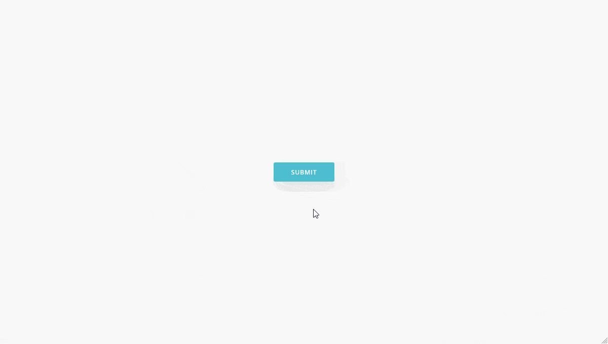
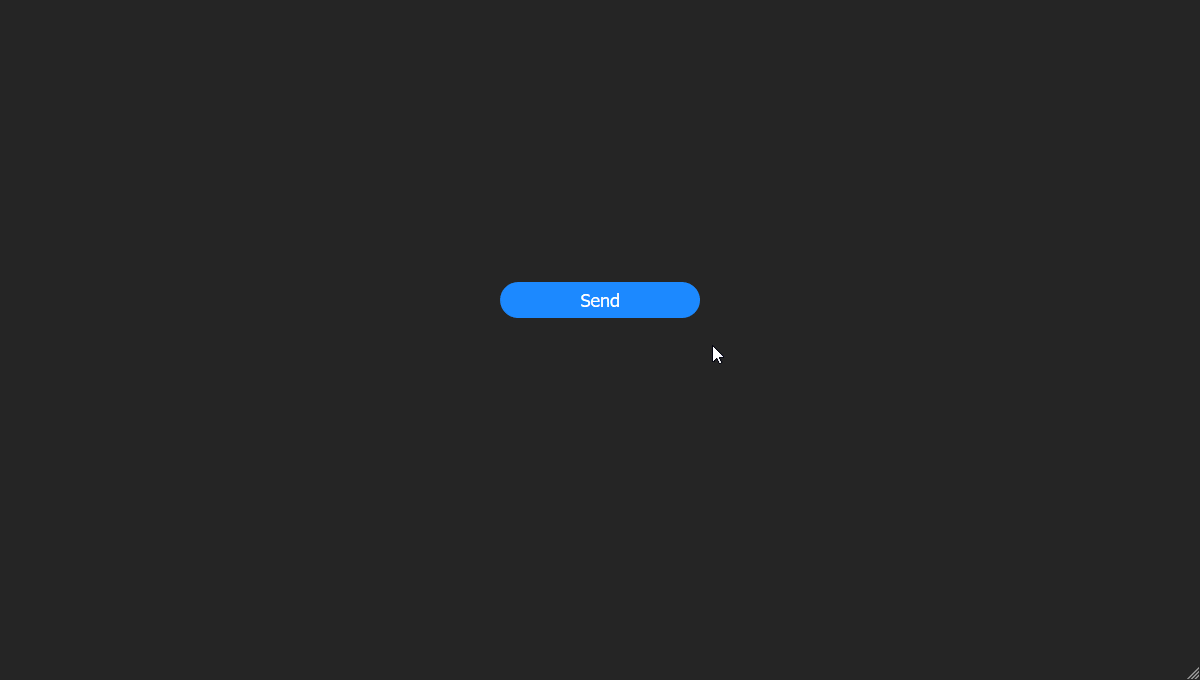
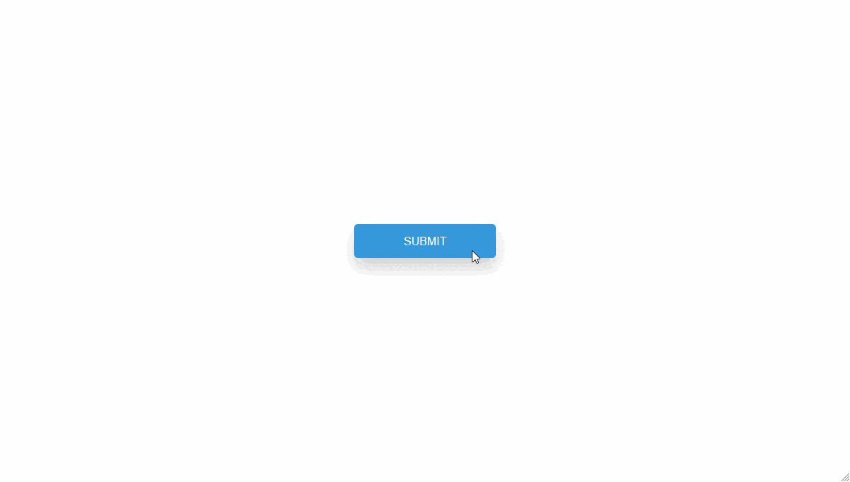
4. SUBMIT LOADER
Made with
HTML / CSS (SCSS) / JavaScript
HTML
<div class="main">
  <button class="button">Send</button>


  <div class="loader">
    <div class="check">
      <span class="check-one"></span>
      <span class="check-two"></span>
    </div>
  </div>

</div>
CSS (SCSS)
* {
  box-sizing: border-box;
}

.main {
  background-color: #262626;
  width: 100%;
  height: 100vh;
  display: flex;
  flex-direction: column;
  justify-content: center;
  align-items: center;
}

.button {
  position: relative;
  display: block;
  width: 200px;
  height: 36px;
  border-radius: 18px;
  background-color: #1c89ff;
  border: solid 1px transparent;
  color: #fff;
  font-size: 18px;
  font-weight: 300;
  cursor: pointer;
  transition: all .1s ease-in-out;
  &:hover {
    background-color: transparent;
    border-color: #fff;
    transition: all .1s ease-in-out;
  }

}


.loader {
  display: flex;
  justify-content: center;
  align-items: center;
  width: 50px;
  height: 50px;
  background: transparent;
  margin: 30px auto 0 auto;
  border: solid 2px #424242;
  border-top: solid 2px #1c89ff;
  border-radius: 50%;
  opacity: 0;
}

.check {
  width: 100%;
  height: 100%;
  display: flex;
  flex-direction: column;
  justify-content: center;
  align-items: center;
  transform: translate3d(-4px,50px,0);
  opacity: 0;
  span:nth-child(1) {
    display: block;
    width: 10px;
    height: 2px;
    background-color: #fff;
    transform: rotate(45deg);
  }
  span:nth-child(2) {
    display: block;
    width: 20px;
    height: 2px;
    background-color: #fff;
    transform: rotate(-45deg) translate3d(14px, -4px, 0);
    transform-origin: 100%;
  }
}

.loader.active {
  animation: loading 2s ease-in-out;
  animation-fill-mode: forwards;
}

.check.active {
  opacity: 1;
  transform: translate3d(-4px,4px,0);
  transition: all .5s cubic-bezier(.49, 1.74, .38, 1.74);
  transition-delay: .2s;
}

@keyframes loading {
  30% {
    opacity:1;
  }

  85% {
    opacity:1;
    transform: rotate(1080deg);
    border-color: #262626;
  }
  100% {
    opacity:1;
    transform: rotate(1080deg);
     border-color: #1c89ff;
  }
}
JS
document.addEventListener('DOMContentLoaded', function () {
  var btn = document.querySelector('.button'),
      loader = document.querySelector('.loader'),
      check = document.querySelector('.check');

  btn.addEventListener('click', function () {
    loader.classList.add('active');
  });

  loader.addEventListener('animationend', function() {
    check.classList.add('active');
  });
});
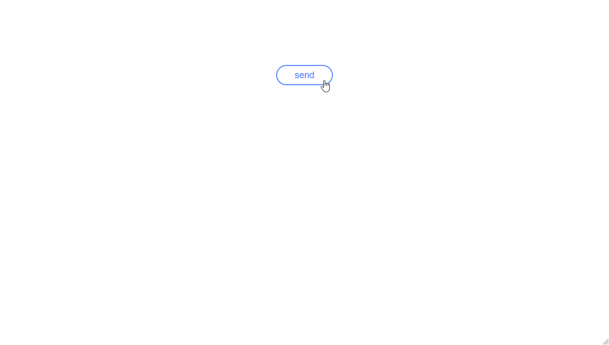
5. ORGANIC BUTTON
Made with
HTML / CSS (SCSS) / JavaScript
HTML
<button type="submit">Send</button>
CSS (SCSS)
@keyframes button-loading {

    0% {

    }

    20% {
        color:transparent;
        transform:scale(1,1);
    }

    40% {
        border-color:#5585ff;
        background-color:transparent;
        transform:scale(1,1);
    }

    60%  {

        transform:scale(.7,1.1);

        margin-left:1.25rem;
        width:2.5rem;
        text-indent:-0.6125rem;

        color:transparent;
        border-color:#5585ff;
        background-color:#5585ff;
    }

    80%  {
        transform:scale(1,1);
    }

    100% {

        margin-left:1.25rem;
        width:2.5rem;

        background-color:#5585ff;
        border-color:#5585ff;
        color:transparent;
    }

}

@keyframes button-dot-intro {

    0% {
        opacity:0;
    }

    60% {
        opacity:1;
        transform:scale(1,1);
    }

    100% {
        transform:scale(.75,.75);
    }

}

@keyframes button-dot-pulse {

    0% {
        opacity:1;
        transform:scale(.75,.75);
    }

    15% {
        transform:scale(.85,.85);
    }

    45% {
        transform:scale(.75,.75);
    }

    55% {
        transform:scale(.95,.95);
    }

    85% {
        transform:scale(.75,.75);
    }

    100% {
        opacity:1;
        transform:scale(.75,.75);
    }

}

@keyframes button-ready {

    0% {
        margin-left:1.25rem;
        width:2.5rem;
    }

    10% {
        background-color:#5585ff;
        border-color:#5585ff;
    }

    70% {
        margin:0;
        width:7.25rem;
        background-color:#fff;
        transform:scale(1.1,1.1);
    }

    100% {
        margin:0;
        width:7rem;
        border-color:#8cce1e;
        background-color:#fff;
    }

}

@keyframes button-dot-outro {

    0% {
        opacity:1;
    }

    100% {
        opacity:0;
        transform:scale(1,1);
    }
}

@keyframes button-ready-label {

    0% {
        opacity:0;
    }

    100% {
        opacity:1;
    }

}


body {
    text-align:center;
    padding:8rem 3rem;
}

button {

    position:relative;
    overflow:hidden;
    width:7rem;
    color:#5585ff;
    border:2px solid #5585ff;
    background-color:transparent;
    cursor:pointer;
    line-height:2;
    margin:0;
    padding:0;
    border-radius:1.5rem;
    font-size:1.125rem;
    text-transform:lowercase;
    outline:none;
    transition:transform .125s;

    &:active {
        transform:scale(.9,.9);
    }

    &:before,
    &:after {
        position:absolute;
        opacity:0;

        border-radius:50%;
        background-color:#fff;
        top:50%;
        left:50%;
        margin-top:-1.125rem;
        margin-left:-1.125rem;
        width:2.25rem;
        height:2.25rem;

        content:'';
        z-index:1;
    }

    &.loading {
        animation:button-loading .5s forwards;
    }

    &.loading:before {
        opacity:1;
        animation:button-dot-intro .5s forwards;
    }

    &.loading:after {
        opacity:0;
        animation:button-dot-pulse 1.5s infinite .5s;
    }

    &.ready {
        text-indent:0;
        color:transparent;
        background-color:#5585ff;
        animation:button-ready .333s forwards;
    }


    &.ready:before {
        position:absolute;
        left:0;
        right:0;
        top:auto;
        margin:0;
        width:auto;
        height:auto;
        border-radius:0;
        background-color:transparent;
        color:#8cce1e;
        content:'ready';
        opacity:0;
        z-index:2;
        animation:button-ready-label .5s forwards .275s;
    }

    &.ready:after {
        opacity:1;
        animation:button-dot-outro .333s;
    }

}
JS
document.querySelector('button').addEventListener('click',function clickHandler(e){

    this.removeEventListener('click',clickHandler,false);

    e.preventDefault();
    var self = this;
    setTimeout(function(){
        self.className = 'loading';
    },125);

    setTimeout(function(){
        self.className = 'ready';
    },4300);

},false);
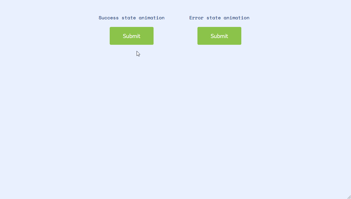
6. ANIMATED SUBMIT BUTTONS
Made with
HTML / CSS (scss) / JavaScript
HTML
<h1>Animated submit buttons</h1>
<div class="wrapper">
<div class="block">Success state animation<br><button class="button success">Submit</button></div>
<div class="block">Error state animation<br><button class="button error">Submit</button></div>
</div>
<small>* The animation resets for demo purposes</small>
CSS (SCSS)
$button-width: 150px;
$spinner-width: $button-width/6;
$blue: #0076d3;
$btn-bg: #8BC34A;
$text-light: #fefefe;

@import url(https://fonts.googleapis.com/css?family=Space+Mono);

*{ box-sizing: border-box;}
body{
  padding: 10px;
  font-size: 16px;
  font-family: 'Space Mono', sans-serif;
  text-align: center;
  background-color: #eaf0ff;
  color: #002868;
}

h1{
  font-size: 1.5em;
}

small{
  color: #888;
}

@media (min-width: 780px){
  .wrapper {
    width: 600px;
    display: grid;
    grid-template-columns: repeat(2, [col] calc(100%/2) );
    grid-auto-rows: 120px;
    margin: 30px auto 40px;
  }
}
.button{
  display: inline-block;
  min-width: $button-width;
  margin: 20px auto;
  background: $btn-bg;
  color: $text-light;
  font-size: 1.2em;
  padding: 1em;
  border-radius: 4px;
  text-align: center;
  position: relative;
  cursor: pointer;
  appearance: none;
  -webkit-appearance: none;
  border: 0;
  transition: border-radius linear 0.05s, width linear 0.05s;


  &:focus{
    outline: 0;
  }

  &.animate{
    width: $button-width/2.2;
    height: $button-width/2.2;
    min-width: 0;
    border-radius: 50%;
    color: transparent;

    &:after{
      position: absolute;
      content: '';
      width: $spinner-width;
      height: $spinner-width;
      border: 4px solid $text-light;
      border-radius: 50%;
      border-left-color: transparent;
      left: 50%;
      top: 50%;
      -webkit-transform: translate(-50%, -50%);
      transform: translate(-50%, -50%);
      animation: spin ease-in 2.5s forwards;
      animation-name: spin;
      -webkit-animation-name: spin;
      transition-timing-function:ease-in-out;
      -webkit-transition-timing-function: ease-in-out;
      animation-duration: 2.5s;
      -webkit-animation-duration: 2.5s;
      animation-fill-mode: forwards;
      -webkit-animation-fill-mode: forwards;
    }

    &.success:before{
      position: absolute;
      content: '';
      width: $spinner-width;
      height: $spinner-width/2;
      border: 4px solid $text-light;
      border-right: 0;
      border-top: 0;
      left: 50%;
      top: 50%;
      -webkit-transform: translate(-50%, -50%) rotate(0deg) scale(0);
      transform: translate(-50%, -50%) rotate(0deg) scale(0);
      -webkit-animation: success ease-in 0.15s forwards;
      animation: success ease-in 0.15s forwards;
      animation-delay: 2.5s;
    }

    &.error{
      position: relative;
      -webkit-animation: vibrate ease-in 0.5s forwards;
      animation: vibrate ease-in 0.5s forwards;
      -webkit-animation-delay: 2.5s;
      animation-delay: 2.5s;

      &:before{
        color: #fff;
        position: absolute;
        content: '!';
        font-size: 1.8rem;
        font-weight: bold;
        text-align: center;
        left: 50%;
        top: 50%;
        -webkit-transform: translate(-50%, -50%) scale(0);
        transform: translate(-50%, -50%) scale(0);
        -webkit-animation: error ease-in 0.5s forwards;
        animation: error ease-in 0.5s forwards;
        animation-delay: 2.5s;
      }
    }
  }
}


@keyframes spin {
    0% { transform: translate(-50%, -50%) rotate(0deg) scale(1);}
    90% { transform: translate(-50%, -50%) rotate(1080deg) scale(1); }
    100% { transform: scale(0); }
    }

@-webkit-keyframes spin {
  0% {-webkit-transform: translate(-50%,-50%) rotate(0deg) scale(1);}

  98% {-webkit-transform: translate(-50%,-50%) rotate(1080deg) scale(1);}

  100% {-webkit-transform: translate(-50%,-50%) rotate(1080deg) scale(0);}
}

@keyframes success{
    from {
       transform: translate(-50%, -50%) rotate(0) scale(0);
       }
    to {
      transform: translate(-50%, -50%) rotate(-45deg) scale(1);
    }
}

@-webkit-keyframes success{
    from {
       -webkit-transform: translate(-50%, -50%) rotate(0) scale(0);
       }
    to {
      -webkit-transform: translate(-50%, -50%) rotate(-45deg) scale(1);
    }
}

@keyframes error {
    from {
    transform: translate(-50%, -50%) scale(0);
    }
    to {
    transform: translate(-50%, -50%) scale(1);
    background-color: #f44336;
    }
}

@-webkit-keyframes error {
    from {
    -webkit-transform: translate(-50%, -50%) scale(0);
    }
    to {
    -webkit-transform: translate(-50%, -50%) scale(1);
    background-color: #f44336;
    }
}


@keyframes vibrate {
    0%, 30%, 60%, 85%, 100% {
      left: 0;
      background-color: #f44336;
    }
    10%, 40%, 90%, 70% {
      left: -2px;
      background-color: #f44336;
    }
    20%, 50%, 80%, 95% {
      left: 2px;
      background-color: #f44336;
    }
}
JS
var animateButton = function(e) {

  e.preventDefault;
  //reset animation
  e.target.classList.remove('animate');

  e.target.classList.add('animate');

  e.target.classList.add('animate');
  setTimeout(function(){
    e.target.classList.remove('animate');
  },6000);
};

var classname = document.getElementsByClassName("button");

for (var i = 0; i < classname.length; i++) {
  classname[i].addEventListener('click', animateButton, false);
}
7. ARROWED SUBMIT BUTTON
Made with
HTML (Pug) / CSS (Stylus)

HTML(PUG)
a(href="#") Submit
CSS (Stylus)
poscenter(m=50%, n=m, tf=)
	position absolute
	left m
	top n
	transform translate(-@left, -@top) tf

b64 = "https://image.flaticon.com/icons/png/128/109/109617.png"

@import url('https://fonts.googleapis.com/css?family=Montserrat')

body // Personal fix, seems to create lines when Chrome is in +1920px
	background #2f2f31
	transform rotateX(0.003deg)
	height 100vh
	color #f

a
	poscenter()
	color #cecd24
	text-decoration none
	font-size 2em
	display inline-block
	font-family Montserrat
	text-transform uppercase
	padding 0.5em 2em
	border 2px solid #cecd24
	transition .02s .2s cubic-bezier(.1, 0, .1, 1)

	&::before
		content ""
		display inline-block
		position absolute
		top 0
		left 0
		right 100%
		bottom 0
		background #cecd24
		transition .3s .2s cubic-bezier(.1, 0, .1, 1), left .3s cubic-bezier(.1, 0, .1, 1)
		z-index -1

	&::after
		content ""
		display inline-block
		background-image url(b64)
		position absolute
		top 0
		left calc(100% - 3em)
		right 3em
		bottom 0
		background-size 1.5em
		background-repeat no-repeat
		background-position center
		transition right .3s cubic-bezier(.1, 0, .1, 1)

	&:hover
		padding 0.5em 3.5em 0.5em 0.5em

		&::before
			left calc(100% - 3em)
			right 0
			transition .3s cubic-bezier(.1, 0, .1, 1), left .3s .2s cubic-bezier(.1, 0, .1, 1)

		&::after
			right 0
			transition right .3s .2s cubic-bezier(.1, 0, .1, 1)
8. BUTTON LOADING ANIMATION
Made with
HTML / CSS (SCSS) / JavaScript
HTML
<button class="button">
	<span class="submit">Submit</span>
	<span class="loading"><i class="fa fa-refresh"></i></span>
	<span class="check"><i class="fa fa-check"></i></span>
</button>
CSS (SCSS)
$base-duration: 500ms;

// Colors
$color-1: #2c3e50;
$color-2: #3498db;
$color-3: #2ecc71;

// Breakpoints
$sm: new-breakpoint(min-width 320px);
$med: new-breakpoint(min-width 768px);
$lg: new-breakpoint(min-width 1024px);

*, *:before, *:after {
	box-sizing: border-box;
	outline: none;
}

html {
	font-family: 'Source Sans Pro', sans-serif;
	font-size: 16px;
	font-smooth: auto;
	font-weight: 300;
	line-height: 1.5;
	color: #444;
}

body {
	position: relative;
	display: flex;
	flex-direction: column;
	align-items: center;
	justify-content: center;
	width: 100%;
	height: 100vh;
	// background-color:darken($color-1, 4%);
}

.hide { display: none;
}

.button {
	position: relative;
	display: flex;
	flex-direction: column;
	align-items: center;
	justify-content: center;
	width: 12.5rem;
	magrin: 0;
	padding: 1.5rem 3.125rem;
	background-color: $color-2;
	border: none;
	border-radius: 0.3125rem;
	box-shadow: 0 12px 24px 0 rgba(0,0,0,0.2);

	//box-shadow:
	//	0 -1.25rem 1rem -1.5rem rgba(black, 0.4),
	//	0 0.5rem 1.75rem -0.25rem rgba(black, 0.3),
	//	0 1.25rem 2.5rem rgba(black, 0.2);
	color: white;
	font-weight: 300;
	text-transform: uppercase;
	//transition: $base-duration ease;
	overflow: hidden;

	&:before {
		position: absolute;
		content: '';
		bottom: 0;
		left: 0;
		width: 0%;
		height: 100%;
		background-color: lighten($color-3,10%);
	}

	span {
		position: absolute;
		line-height: 0;

		i {
			transform-origin: center center;
		}

		&:nth-of-type(1) {
			top: 50%;
			transform: translateY(-50%);
		}

		&:nth-of-type(2) {
			top: 100%;
			transform: translateY(0%);
			font-size: 24px;
		}

		&:nth-of-type(3) {
			display: none;
		}
	}
}

.active {
	background-color: $color-3;

	&:before {
		width: 100%;
		transition: width 3s linear;
	}

	span {

		&:nth-of-type(1) {
			top: -100%;
			transform: translateY(-50%);
		}

		&:nth-of-type(2) {
			top: 50%;
			transform: translateY(-50%);

			i {
				animation: loading $base-duration linear infinite;
			}
		}

		&:nth-of-type(3) {
			display: none;
		}
	}
}

.finished {
	background-color: lighten($color-3,10%);

	.submit {
		display: none;
	}

	.loading {
		display: none;
	}

	.check {
		display: block !important;
		font-size: 24px;
		animation: scale 0.5s linear;

		i {
			transform-origin: center center;
		}
	}

}

@keyframes loading {
	100% { transform: rotate(360deg); }
}

@keyframes scale {
	0%   { transform: scale(10); }
	50%  { transform: scale(0.2); }
	70%  { transform: scale(1.2); }
	90%  { transform: scale(0.7); }
	100% { transform: scale(1); }
}
JS
const button = document.querySelector('.button');
const submit = document.querySelector('.submit');

function toggleClass() {
	this.classList.toggle('active');
}

function addClass() {
	this.classList.add('finished');
}

button.addEventListener('click', toggleClass);
button.addEventListener('transitionend', toggleClass);
button.addEventListener('transitionend', addClass);
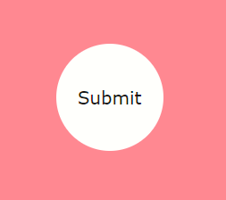
9. BUTTON INTERACTION
MADE WITH:
HTML / CSS / JavaScript
HTML
<div class="button">
	<div class="container">
		<div class="tick">
		</div>
	</div>
</div>
CSS
body, .button, .tick {
  display: flex;
  justify-content: center;
  align-items: center;
  font-family: sans-serif;
}

body {
  width: 100%;
  height: 90vh;
}

.button {
  width: 300px;
  height: 80px;
  background: dodgerblue;
  border-radius: 6px;
  transition: all .3s cubic-bezier(0.67, 0.17, 0.40, 0.83);
}

.button svg {
  transform: rotate(180deg);
  transition: all .5s;
}

.button__circle {
  width: 120px;
  height: 120px;
  background: mediumseagreen;
  border-radius: 50%;
  transform: rotate(-180deg);
}

.button:hover {
  cursor: pointer;
}

.tick {
  color: white;
  font-size: 2em;
  transition: all .9s;
}
JS
let button = document.querySelector('.button');
let buttonText = document.querySelector('.tick');

const tickMark = "<svg width=\"58\" height=\"45\" viewBox=\"0 0 58 45\" xmlns=\"http://www.w3.org/2000/svg\"><path fill=\"#fff\" fill-rule=\"nonzero\" d=\"M19.11 44.64L.27 25.81l5.66-5.66 13.18 13.18L52.07.38l5.65 5.65\"/></svg>";

buttonText.innerHTML = "Submit";

button.addEventListener('click', function() {

  if (buttonText.innerHTML !== "Submit") {
    buttonText.innerHTML = "Submit";
  } else if (buttonText.innerHTML === "Submit") {
    buttonText.innerHTML = tickMark;
  }
  this.classList.toggle('button__circle');
});
10. SEND BUTTON
MADE WITH
HTML / CSS / JavaScript

HTML
<div class="container">
			<button class="btn btn-inside btn-boarder"><img src="https://i.cloudup.com/gBzAn-oW_S-2000x2000.png" width="64px" height="64px" id="plane"></button>
			<div class="bg"><img src="https://i.cloudup.com/2ZAX3hVsBE-3000x3000.png" id="bg" width="32px" height="32px" style="opacity:0;"></div>
			<div class="around around-boarder" onclick="ani(); anitwo();"></div>
		</div>
CSS
html {
	background: #FF7F50 no-repeat center center fixed;
	-webkit-background-size: cover;
	-moz-background-size: cover;
	-o-background-size: cover;
	background-size: cover;
	overflow: hidden;
}

.container {
	width: 500px;
	height: 500px;
	position: absolute;
	top: 0;
	bottom: 0;
	left: 0;
	right: 0;
	margin: auto;
}

.btn {
	width: 100px;
	height: 100px;
    border: none;
    color: inherit;
    background: none;
    display: inline-block;
    text-transform: uppercase;
    letter-spacing: 1px;
    font-weight: 300;
    outline: none;
    position: absolute;
    -webkit-transition: all 0.3s;
    -moz-transition: all 0.3s;
    transition: all 0.3s;
    top: 0;
    bottom: 0;
    left: 0;
    right: 0;
    margin: auto;
}

.btn img{
    top: 0;
    bottom: 0;
    left: 0;
    right: 0;
    margin: auto;
}

.btn:after {
    content: '';
    position: absolute;
    z-index: -1;
    -webkit-transition: all 0.3s;
    -moz-transition: all 0.3s;
    transition: all 0.3s;
}

.bg {
    height: 32px;
    width: 32px;
    position: absolute;
    top: 0;
    bottom: 0;
    left: 0;
    right: 0;
    margin: auto;
}

.btn-boarder {
    border: 2px solid #fff;
    border-radius: 50%;
}

.animation {
    -webkit-transform: translate(100px, -100px);
    -moz-transform: translate(100px, -100px);
    -o-transform: translate(100px, -100px);
    -ms-transform: translate(100px, -100px);
    transform: translate(100px, -100px);
    -webkit-transition: all 0.3s linear;
    -moz-transition: all 0.3s linear;
    -o-transition: all 0.3s linear;
    transition: all 0.3s linear;
}

.animation2 {
    -webkit-animation: fadeIn 0.4s ease-out;
    -webkit-animation-iteration-count: 1;
    -webkit-animation-fill-mode: forwards;
    -webkit-animation-delay: 0.4s;
    -moz-animation: fadeIn 0.4s ease-out;
    -moz-animation-iteration-count: 1;
    -moz-animation-fill-mode: forwards;
    -moz-animation-delay: 0.4s;
    animation: fadeIn 0.4s ease-out;
    animation-iteration-count: 1;
    animation-fill-mode: forwards;
    animation-delay: 0.4s;
}

@-webkit-keyframes fadeIn {
    0% {
        opacity: 0;
    }

    100% {
        opacity: 1;
    }
}

@keyframes fadeIn {
    0% {
        opacity: 0;
    }

    100% {
        opacity: 1;
    }
}
.around {
    width: 101px;
    height: 101px;
    border: none;
    color: inherit;
    background: none;
    cursor: pointer;
    display: inline-block;
    text-transform: uppercase;
    letter-spacing: 1px;
    font-weight: 300;
    outline: none;
    position: absolute;
    -webkit-transition: all 0.3s;
    -moz-transition: all 0.3s;
    transition: all 0.3s;
    top: 0;
    bottom: 0;
    left: 0;
    right: 0;
    margin: auto;
}

.around:after {
    content: '';
    position: absolute;
    z-index: -1;
}

.around-boarder {
    border: 120px solid #FF7F50;
    border-radius: 50%;
}
JS
 function ani(){
            document.getElementById('plane').className ='animation';
        }
        function anitwo(){
            document.getElementById('bg').className ='animation2';
        }
11. Submit Button with Loading Effect
MADE WITH
HTML / CSS / JavaScript

HTML
<div class="container">
  <button type="submit"><strong>Submit <i class="fa fa-paper-plane" aria-hidden="true"></i></strong><span class="bar"><span class="load"></span><span></button>
</div>
CSS
@import url('https://fonts.googleapis.com/css?family=Oswald:400,600');

* {
  margin: 0;
  padding: 0;
  box-sizing: border-box;
}

body {
  width: 100%;
  height: 100vh;
  display: -webkit-box;
  display: -ms-flexbox;
  display: flex;
  -webkit-box-pack: center;
      -ms-flex-pack: center;
          justify-content: center;
  -webkit-box-align: center;
      -ms-flex-align: center;
          align-items: center;
  background-color: #ccffdc;
  overflow: hidden;
}

.container {
  position: relative;
  display: -webkit-box;
  display: -ms-flexbox;
  display: flex;
  -webkit-box-align: center;
      -ms-flex-align: center;
          align-items: center;
  -webkit-box-pack:center;
      -ms-flex-pack:center;
          justify-content:center;
  width:300px;
  height: 300px;
}

button {
  position: relative;
  width: 200px;
  height: 70px;
  border: none;
  border-radius: 5px;
  font-size: 1.5em;
  background-color:#ff6600;
  color: #fff;
  padding: 0 10px;
  font-family: 'Oswald', sans-serif;
  outline: 0;
}
button:hover {
  cursor: pointer;
  -webkit-animation: moveButton 0.4s ease forwards;
          animation: moveButton 0.4s ease forwards;
}
.bar ,
.load {
  position: absolute;
  bottom: 10%;
  left: 0%;
  width: 95%;
  height: 5px;
  background-color: #b34700;
  border-radius: 20px;
  opacity: 0;
  box-sizing: border-box;
  margin: 0 4.5px;
}

.load {
  background-color: #fff;
  z-index: 1;
  width: 0%;
}

button:active {
  outline: 0;
}

button:hover .bar {
  opacity: 1;
  -webkit-transition: all 0.2s ease;
  transition: all 0.2s ease;
}
button:hover > strong > i {
  -webkit-animation: tremble 0.5s 0.4s ease;
          animation: tremble 0.5s 0.4s ease;
}
button:hover .load {
  opacity: 1;
  -webkit-transition: all 0.5s ease;
  transition: all 0.5s ease;
}

.loading {
  position: absolute;
  top: 0px;
  left: -5px;
  width: 100%;
  opacity: 1;
  -webkit-transition: all 5s 0.1s linear;
  transition: all 5s 0.1s linear;
}

button.complete {
  background-color: #4EBA4E;
  -webkit-transition: all 0.5s ease-in-out;
  transition: all 0.5s ease-in-out;
}
button.complete .bar,
button.complete strong,
button.complete .load {
  opacity: 0;
}
button.complete:before {
  content: '\f00c';
  font-family: 'fontawesome';
  -webkit-transition: all 0.5s ease;
  transition: all 0.5s ease;
  font-weight: 600;
  position: absolute;
  left: 50%;
  -webkit-transform: translateX(-50%) scale(1.2);
          transform: translateX(-50%) scale(1.2);
  color: #fff;
  font-size: 1.5em;
  opacity: 0;
  -webkit-animation: appear 0.5s 0.2s ease-in-out forwards;
          animation: appear 0.5s 0.2s ease-in-out forwards;
}

@-webkit-keyframes appear {
  from {
    opacity: 0;
  }
  to {
    opacity: 1;
  }
}

@keyframes appear {
  from {
    opacity: 0;
  }
  to {
    opacity: 1;
  }
}

@-webkit-keyframes tremble {
  0% {
    -webkit-transform: rotate(0deg);
            transform: rotate(0deg);
  }
  25% {
    -webkit-transform: rotate(-10deg);
            transform: rotate(-10deg);
  }
  50% {
    -webkit-transform: rotate(0deg);
            transform: rotate(0deg);
  }
  75% {
    -webkit-transform: rotate(10deg);
            transform: rotate(10deg);
  }
  100% {
    -webkit-transform: rotate(0deg);
            transform: rotate(0deg);
  }
}

@-webkit-keyframes tremble-end {
  0% {
    -webkit-transform: rotate(0deg) translateX(-50%);
            transform: rotate(0deg) translateX(-50%);
  }
  25% {
    -webkit-transform: rotate(-10deg) translateX(-50%);
            transform: rotate(-10deg) translateX(-50%);
  }
  50% {
    -webkit-transform: rotate(0deg) translateX(-50%);
            transform: rotate(0deg) translateX(-50%);
  }
  75% {
    -webkit-transform: rotate(10deg) translateX(-50%);
            transform: rotate(10deg) translateX(-50%);
  }
  100% {
    -webkit-transform: rotate(0deg) translateX(-50%);
            transform: rotate(0deg) translateX(-50%);
  }
}

@keyframes tremble {
  0% {
    -webkit-transform: rotate(0deg);
            transform: rotate(0deg);
  }
  25% {
    -webkit-transform: rotate(-10deg);
            transform: rotate(-10deg);
  }
  50% {
    -webkit-transform: rotate(0deg);
            transform: rotate(0deg);
  }
  75% {
    -webkit-transform: rotate(10deg);
            transform: rotate(10deg);
  }
  100% {
    -webkit-transform: rotate(0deg);
            transform: rotate(0deg);
  }
}

@-webkit-keyframes moveButton {
  0% {
    width: 200px;
    -webkit-transform: skew(0deg);
            transform: skew(0deg);
    border-radius: 5px;
  }
  10% {
    -webkit-transform: translateY(-12px) skew(-10deg);
            transform: translateY(-12px) skew(-10deg);
    border-top-left-radius: 10px;
    border-bottom-right-radius: 10px;
  }
  15% {
    -webkit-transform: translateY(-7px) skew(10deg);
            transform: translateY(-7px) skew(10deg);
    border-top-left-radius: 10px;
    border-bottom-right-radius: 10px;
  }
  20% {
    -webkit-transform: translateY(-2px) skew(-15deg);
            transform: translateY(-2px) skew(-15deg);
    border-top-left-radius: 15px;
    border-bottom-right-radius: 15px;
  }
  30% {
    -webkit-transform: translateY(0px) skew(15deg);
            transform: translateY(0px) skew(15deg);
    border-top-left-radius: 15px;
    border-bottom-right-radius: 15px;
  }
  40% {
    -webkit-transform: skew(-20deg);
            transform: skew(-20deg);
    width: 210px;
    border-top-left-radius: 20px;
    border-bottom-right-radius: 20px;
  }
  50% {
    -webkit-transform: skew(20deg);
            transform: skew(20deg);
    width: 210px;
    border-top-left-radius: 20px;
    border-bottom-right-radius: 20px;
  }
  60% {
    -webkit-transform: skew(-15deg);
            transform: skew(-15deg);
    width: 200px;
    border-top-right-radius: 20px;
    border-bottom-left-radius: 20px;
  }
  70% {
    -webkit-transform: skew(15deg);
            transform: skew(15deg);
    width: 200px;
    border-top-right-radius: 20px;
    border-bottom-left-radius: 20px;
  }
  80% {
    -webkit-transform: skew(-10deg);
            transform: skew(-10deg);
    width: 200px;
    border-top-right-radius: 15px;
    border-bottom-left-radius: 15px;
  }
  90% {
    -webkit-transform: skew(5deg);
            transform: skew(5deg);
    width: 200px;
    border-top-right-radius: 10px;
    border-bottom-left-radius: 10px;
  }
  100% {
    -webkit-transform: skew(0deg);
            transform: skew(0deg);
    width: 200px;
    border-radius: 5px;
  }
}

@keyframes moveButton {
  0% {
    width: 200px;
    -webkit-transform: skew(0deg);
            transform: skew(0deg);
    border-radius: 5px;
  }
  10% {
    -webkit-transform: translateY(-12px) skew(-10deg);
            transform: translateY(-12px) skew(-10deg);
    border-top-left-radius: 10px;
    border-bottom-right-radius: 10px;
  }
  15% {
    -webkit-transform: translateY(-7px) skew(10deg);
            transform: translateY(-7px) skew(10deg);
    border-top-left-radius: 10px;
    border-bottom-right-radius: 10px;
  }
  20% {
    -webkit-transform: translateY(-2px) skew(-15deg);
            transform: translateY(-2px) skew(-15deg);
    border-top-left-radius: 15px;
    border-bottom-right-radius: 15px;
  }
  30% {
    -webkit-transform: translateY(0px) skew(15deg);
            transform: translateY(0px) skew(15deg);
    border-top-left-radius: 15px;
    border-bottom-right-radius: 15px;
  }
  40% {
    -webkit-transform: skew(-20deg);
            transform: skew(-20deg);
    width: 210px;
    border-top-left-radius: 20px;
    border-bottom-right-radius: 20px;
  }
  50% {
    -webkit-transform: skew(20deg);
            transform: skew(20deg);
    width: 210px;
    border-top-left-radius: 20px;
    border-bottom-right-radius: 20px;
  }
  60% {
    -webkit-transform: skew(-15deg);
            transform: skew(-15deg);
    width: 200px;
    border-top-right-radius: 20px;
    border-bottom-left-radius: 20px;
  }
  70% {
    -webkit-transform: skew(15deg);
            transform: skew(15deg);
    width: 200px;
    border-top-right-radius: 20px;
    border-bottom-left-radius: 20px;
  }
  80% {
    -webkit-transform: skew(-10deg);
            transform: skew(-10deg);
    width: 200px;
    border-top-right-radius: 15px;
    border-bottom-left-radius: 15px;
  }
  90% {
    -webkit-transform: skew(5deg);
            transform: skew(5deg);
    width: 200px;
    border-top-right-radius: 10px;
    border-bottom-left-radius: 10px;
  }
  100% {
    -webkit-transform: skew(0deg);
            transform: skew(0deg);
    width: 200px;
    border-radius: 5px;
  }
}
JS
var lBar = $(".load");
var bar = $("button span");
var button = $("button");

button.on("click", function(){
     lBar.addClass("loading");
     setTimeout(function(){
        lBar.removeClass("loading");
        button.addClass("complete");
     },500);
});
12. Submit Button pure css animation
MADE WITH
HTML / CSS
HTML
<div class="cont">
<button class="btn"><span>Submit</span><img src="https://i.cloudup.com/2ZAX3hVsBE-3000x3000.png" height="62" width="62"></button>
</div>
CSS
@-webkit-keyframes {
}
@-webkit-keyframes extend {
    0% {
        width: 600px;
        height: 200px;
        border-radius: 100px;
        } 10% {
        width: 610px;
        height: 210px;
        background: #fff;
        margin-left: - 5px;
        margin-top: - 5px;
        } 20% {
        width: 600px;
        height: 200px;
        background: #6fb07f;
        margin-left: 0px;
        margin-top: 0px;
        } 100% {
        width: 200px;
        height: 200px;
        border-radius: 100px;
        margin-left: 190px;
        background: #6fb07f;
        }
    }
@keyframes extend {
    0% {
        width: 600px;
        height: 200px;
        border-radius: 100px;
        } 10% {
        width: 610px;
        height: 210px;
        background: #fff;
        margin-left: - 5px;
        margin-top: - 5px;
        } 20% {
        width: 600px;
        height: 200px;
        background: #6fb07f;
        margin-left: 0px;
        margin-top: 0px;
        } 100% {
        width: 200px;
        height: 200px;
        border-radius: 100px;
        margin-left: 190px;
        background: #6fb07f;
        }
    }
@-webkit-keyframes {
}
@-webkit-keyframes disappear {
    0% {
        opacity: 1;
        } 20% {
        color: #fff;
        } 100% {
        opacity: 0;
        }
    }
@keyframes disappear {
    0% {
        opacity: 1;
        } 20% {
        color: #fff;
        } 100% {
        opacity: 0;
        }
    }
@-webkit-keyframes {
}
@-webkit-keyframes appear {
    0% {
        opacity: 0;
        } 70% {
        opacity: 0;
        } 100% {
        opacity: 1;
        }
    }
@keyframes appear {
    0% {
        opacity: 0;
        } 70% {
        opacity: 0;
        } 100% {
        opacity: 1;
        }
    }
html {
    background: #fff
    }

input, button, submit {
    border: none
    }

.cont {
    position: absolute;
    width: 610px;
    height: 10px;
    left: 50%;
    top: 50%;
    margin: -100px 0 0 -300px
    }

button {
    border-width: 1px;
    width: 600px;
    height: 200px;
    /*border-radius*/
    border-radius: 100px;
    background: #fff;
    position: absolute;
    border: 5px solid #6fb07f
    }

button > span {
    font-size: 48px;
    color: #6fb07f
    }

img {
    position: absolute;
    top: 0;
    left: 0;
    right: 0;
    bottom: 0;
    margin: auto;
    -ms-filter: "progid:DXImageTransform.Microsoft.Alpha(Opacity=0)";
    filter: alpha(opacity=0);
    opacity: 0
    }

button:focus {
    /*animation*/
    -webkit-animation: extend 1s ease-in-out;
    -ms-animation: extend 1s ease-in-out;
    animation: extend 1s ease-in-out;
    -webkit-animation-fill-mode: forwards;
    /* Chrome, Safari, Opera */
    animation-fill-mode: forwards
    }

button:focus > span {
    /*animation*/
    -webkit-animation: disappear 1s ease-in-out;
    -ms-animation: disappear 1s ease-in-out;
    animation: disappear 1s ease-in-out;
    -webkit-animation-fill-mode: forwards;
    /* Chrome, Safari, Opera */
    animation-fill-mode: forwards
    }

button:focus > img {
    /*animation*/
    -webkit-animation: appear 1s ease-in-out;
    -ms-animation: appear 1s ease-in-out;
    animation: appear 1s ease-in-out;
    -webkit-animation-fill-mode: forwards;
    /* Chrome, Safari, Opera */
    animation-fill-mode: forwards
    }
- वनप्लस 10 प्रो उत्तरी अमेरिका में दुर्भाग्य से 65W फास्ट चार्जिंग तक सीमित रहेगा
- Year 2038 Problem Fix
13. Fun Submit Button!
MADE WITH
HTML (PUG) / CSS (SCSS) | JS (Babel)
HTML (PUG)
.container
  .submit
    | <span class='submit__text'>Submit</span>
  .ball.ball-1
  .ball.ball-2
  .ball.ball-3
  .ball.ball-4
| <div id="slider"></div>
CSS (SCSS)
$green: #55dbb1;
$background: #f2f2f2;

body {
  background: $background;
  height: 100vh;
  display: flex;
  align-items: center;
  justify-content: center;
}

.container {
  // background: peachpuff;
  width: 26em;
  display: flex;
}

.submit {
  background: $green;
  height: 2.7em;
  width: 13em;
  border-radius: 2em;
  display: flex;
  justify-content: center;
  align-items: center;
  color: white;
  font-family: roboto;
  font-weight: 400;
  font-size: 2em;
  letter-spacing: 3px;
  cursor: pointer;
}

.submit__text {
  opacity: 1;

  &.active {
    transition: 0.5s;
    opacity: 1;
  }
}

.ball {
  height: 2.7em;
  width: 0em;
  transform: scale(0);
  border-radius: 50%;
  background: $green;
  font-size: 2em;
  display: inline;

  &.ball-1 {
    margin-left: -23%;
  }
}


#slider {
  position: absolute;
  top: 70%;
  width: 100px;
}
JS (Babel)
let tl = new TimelineLite();
const slider = $("#slider");

const rename = () => {
  tl.pause();
  tl.progress(0);
  $('.submit__text').html('Submit').removeClass('fa fa-check').addClass('active').css('pointer-events', 'auto');
  $('.container').css('pointer-events', 'auto');
}

$('.submit').on('click', () => {
  tl.play();
  tl.to('.submit', 1.1, {
    width: '2.7em',
    transform: 'translateX(-100%)',
    ease: Back.easeOut
  }, 'first')
  tl.to('.submit__text', 0.24, {
      opacity: 0,
      ease: Power3.easeOut,
      onComplete: () => {
        $('.submit__text').html('').addClass('fa fa-check').removeClass('active').css('pointer-events', 'none');
        $('.container').css('pointer-events', 'none');
      }
    }, 'first')
  tl.to('.submit', 1, {
      transform: 'translateX(2100%)',
      ease: Back.easeOut
    }, 'translate')
  tl.staggerTo('.ball', 0.2, {
      transform: 'scale(1)',
      width: '2.7em',
      // ease: Back.easeOut
    }, 0.075, 'translate')

  //1
  tl.to('.ball-1', 0.25, {
      transform: 'translateX(-900%)',
      marginTop: '-1em',
    ease: Power0.easeIn,

  }, 'translate -= 0.05')
  tl.to('.ball-1', 0.28, {
      transform: 'translateX(0%)',
      marginTop: '0em',
      ease: Power0.easeOut
  }, 'bounce-1')
  tl.to('.submit', 0.25, {
      transform: 'translateX(2800%)',
      marginTop: '-1em',
    ease: Power0.easeIn
  }, 'bounce-1 -= 0.05')
  tl.to('.submit', 0.28, {
      transform: 'translateX(2100%)',
      marginTop: '0em',
      ease: Power0.easeOut
  }, 'bounce-1.5')
  //2
  tl.to('.ball-1', 0.25, {
      transform: 'translateX(-900%)',
      marginTop: '-1em',
    ease: Power0.easeIn
  }, 'bounce-1.5 -= 0.05')
  tl.to('.ball-1', 0.28, {
      transform: 'translateX(0%)',
      marginTop: '0em',
      ease: Power0.easeOut
  }, 'bounce-2')
  tl.to('.submit', 0.25, {
      transform: 'translateX(2800%)',
      marginTop: '-1em',
    ease: Power0.easeIn
  }, 'bounce-2 -= 0.05')
  tl.to('.submit', 0.28, {
      transform: 'translateX(2100%)',
      marginTop: '0em',
      ease: Power0.easeOut
  }, 'bounce-3')
  tl.to('.ball-1', 0.25, {
      transform: 'translateX(-900%)',
      marginTop: '-1em',
    ease: Power0.easeIn
  },  'bounce-3 -=0.1')
  tl.to('.ball-1', 0.28, {
      transform: 'translateX(0%)',
      marginTop: '0em',
      ease: Power0.easeOut
  }, 'bounce-4')
  tl.to('.submit', 0.25, {
      transform: 'translateX(2800%)',
      marginTop: '-1em',
    ease: Power0.easeIn
  }, 'bounce-4 -= 0.05')
  tl.to('.submit', 0.28, {
      transform: 'translateX(2100%)',
      marginTop: '0em',
      ease: Power0.easeOut
  }, 'bounce-5')
  tl.to('.submit', 0.5, {
    transform: 'translateX(0%)',
  }, 'bounce-5 -= 0.03')
  tl.staggerTo('.ball', 0.35, {
      transform: 'scale(0)',
      width: '0em'
  }, -0.1, 'bounce-5 -= 0.03')
  tl.to('.submit', 0.25, {
    width: '13em',
  }, 'final')
  tl.to('.submit__text', 1, {
    opacity: 1,
    transform: 'scale(1.05)',
    onComplete: () => {
      setTimeout(rename, 2000);
    }
  })
})
- SanDisk Pro SSD 1TB Review
- Universe Sandbox Download Free for PC
- Fonts Pack10000 Download for PC Free
14. Spinning Submit Button
MADE WITH
HTML / CSS
HTML
<input type="submit"/>
CSS
body {
  display: flex;
  min-height: 500px;
  justify-content: center;
  align-items: center;
  background: #f8a;
}
input[type="submit"] {
  display: block;
  font-family: Verdana,"Rockwell",Helvetica,Serif;
  font-size: 20px;
  width: 120px;
  height: 120px;
  background: #fff;
	padding: 10px;
	border: 0;
	outline: 0;
	border-radius: 50%;
  color: #171717;
  transition: all 200ms;
  cursor: pointer;
}
input[type="submit"]:focus {
  background: transparent;
  color: transparent;
  border: none;
  border-top: solid 3px #f8a;
  border-left: solid 3px #fff;
  animation: spin 700ms linear infinite;
}
@keyframes spin {
  to {transform: rotate(360deg);}
}
15. Submit Button with Animation
MADE WITH
HTML / CSS (SCSS) / JS (Babel)

HTML
<!-- from https://dribbble.com/shots/4713597-Button-Micro-Interaction -->

<div class="c-container">
  <button class="c-btn__continue" id="continue-btn">
    <span>Continue</span>

    <svg version="1.1" xmlns="http://www.w3.org/2000/svg" xmlns:xlink="http://www.w3.org/1999/xlink" x="0px" y="0px"
	 viewBox="0 0 37 37" xml:space="preserve" class="u-loading" id="loading">
<path class="circ path" style="fill:none;stroke:#fff;stroke-width:3;stroke-linejoin:round;stroke-miterlimit:10;" d="
	M30.5,6.5L30.5,6.5c6.6,6.6,6.6,17.4,0,24l0,0c-6.6,6.6-17.4,6.6-24,0l0,0c-6.6-6.6-6.6-17.4,0-24l0,0C13.1-0.2,23.9-0.2,30.5,6.5z"
	/>
</svg>
  <svg version="1.1" xmlns="http://www.w3.org/2000/svg" xmlns:xlink="http://www.w3.org/1999/xlink" x="0px" y="0px"
	 viewBox="0 0 37 37" xml:space="preserve" class="u-success">
<polyline class="tick path" style="fill:none;stroke:#fff;stroke-width:3;stroke-linejoin:round;stroke-miterlimit:10;" points="
	11.6,20 15.9,24.2 26.4,13.8 "/>
</svg>
  </button>

</div>
<!-- logo grid for design credits -->
<a href="https://dribbble.com/shots/4713597-Button-Micro-Interaction" target="_blank">
  <div class="u-logo">
    Design from
    <svg xmlns="http://www.w3.org/2000/svg" width="132" class="u-logo__svg" height="32" viewBox="0 0 132 32" fill="none">
<rect width="131.556" height="32" fill="white" fill-opacity="0"></rect>
<path fill-rule="evenodd" clip-rule="evenodd" d="M131.352 25.2639C125.854 34.5449 117.148 31.8518 114.533 29.7433C113.42 30.4952 111.469 32.1431 108.867 31.953C103.325 31.5478 101.341 23.6623 101.341 23.6623C101.381 23.6939 99.6903 24.2432 98.7766 24.2335C98.7648 26.5459 96.7573 32.0699 91.3398 31.9993C85.2603 31.9204 84.0244 22.9014 84.0244 22.9014C84.0244 22.9014 83.4194 23.7379 81.1191 24.5711C81.2348 22.7945 81.1501 31.7289 73.8638 31.8602C68.1035 31.9641 66.5484 22.7623 66.5484 22.7623C66.5484 22.7623 65.549 23.796 63.6124 24.1545C63.7355 22.349 63.5355 31.8905 56.2481 31.8602C51.3235 31.8397 49.6406 26.1918 49.7715 25.408C49.9385 24.4088 48.1071 32.0007 43.3235 31.8824C41.3495 31.8246 39.8777 30.4015 38.9543 28.5039C37.7181 29.9126 35.9231 31.8824 33.9096 31.8824C30.2954 31.8824 28.7019 28.8722 28.9718 20.2744C28.9948 19.2548 28.9209 18.8536 27.903 18.7011C27.2919 18.5996 26.6661 18.4075 26.0041 18.306C25.7919 19.0112 23.9919 31.6529 17.8027 31.8928C15.7264 31.9735 14.5911 30.1824 13.6587 28.853C12.2294 30.7358 10.3427 31.953 7.65493 31.953C3.10203 31.953 0 28.2879 0 23.7668C0 19.2457 3.10203 15.581 7.65493 15.581C8.45992 15.581 8.6859 15.6959 9.42132 15.9096C7.90892 2.19775 11.4806 0.0547897 14.6051 0.0547897C17.6047 0.0547897 22.7294 6.98749 15.5186 24.5725C17.1195 29.8176 20.5707 29.5209 22.2293 18.7236C22.5667 16.5287 21.6642 13.567 23.0681 13.1536C25.6343 12.3982 25.9066 14.6648 27.1097 15.0424C28.3821 15.4416 29.1247 15.4026 30.346 15.6566C32.4331 16.0624 33.2476 17.1788 32.9932 19.6653C32.6879 22.8117 32.1538 27.3909 33.7824 27.9489C34.9569 28.3544 37.1013 25.9291 37.4775 24.602C37.8537 23.275 37.9323 22.8207 37.9657 21.8474C38.0167 19.7671 38.0804 18.2422 38.4367 16.6688C38.5892 16.0601 38.763 15.6569 39.4547 15.6294C40.0238 15.6149 41.0647 15.4442 41.5229 15.7994C42.1336 16.2563 42.0573 16.7199 41.9871 17.9401C41.2769 35.3378 46.7434 26.6528 48.3733 19.6986C47.793 11.8351 48.1915 0.198785 53.14 0.00362164C55.7137 -0.0978739 56.8514 1.95518 56.9765 3.4876C57.3305 7.81568 55.3476 14.9851 52.7399 19.8065C51.2496 29.6443 59.2563 31.5896 60.5367 23.737C58.4418 22.7452 56.1779 18.7308 58.0201 16.7744C59.0539 15.6765 63.357 17.2539 63.4275 20.6938C65.5382 20.1317 65.82 18.9451 65.8493 19.1417C65.269 11.2782 65.8071 0.198885 70.756 0.00372212C73.3293 -0.0977734 74.467 1.95528 74.5922 3.4877C74.9461 7.81578 72.9633 14.9852 70.3559 19.8066C68.8653 29.6444 76.8723 31.5896 78.1524 23.7371C76.6014 23.4391 73.3273 19.1693 75.2164 16.7745C76.2259 15.4948 80.5131 18.156 80.9932 20.8078C83.021 20.2363 83.2963 19.0873 83.3253 19.2808C82.745 11.4175 83.2831 0.338244 88.232 0.143081C90.8053 0.0415859 91.943 2.09464 92.0682 3.62705C92.4221 7.95514 90.4393 15.1247 87.8316 19.9462C86.3413 29.7839 94.348 31.7288 95.6284 23.8763C93.4971 23.5229 90.4679 19.0145 92.906 16.7081C93.88 15.7866 97.6018 18.1786 98.473 20.9077C99.6835 20.8613 100.437 20.4457 100.599 20.4037C98.6659 11.1725 100.105 0.0963155 105.428 0.00385746C108.306 -0.0460672 111.119 1.55286 109.884 10.3352C108.705 18.7145 104.469 22.2311 104.479 22.2849C104.725 23.2887 106.899 31.6899 112.374 27.2572C112.09 26.6182 111.806 25.9654 111.648 25.1745C110.741 20.5681 112.523 15.365 117.367 14.524C120.142 14.0423 122.757 15.3878 123.17 18.4212C123.85 23.3848 119.349 26.9797 117.638 27.7594C116.871 27.3257 124.587 32.2533 129.166 22.3783C129.432 21.8145 129.752 21.8622 130.166 22.1528C130.459 22.3581 132.128 23.9318 131.352 25.2639ZM10.9668 22.5472C10.7338 21.8535 10.2556 20.3252 10.0865 19.663C9.15532 18.8567 8.49065 18.7256 7.29537 18.7256C4.63907 18.7256 3.07561 21.1711 3.07561 23.8081C3.07561 26.4451 4.77888 28.891 7.43518 28.891C9.73719 28.891 11.4892 27.3324 12.0237 25.1261C11.6496 24.266 11.2785 23.4755 10.9668 22.5472ZM14.54 3.6844C12.6735 3.6844 12.0404 8.11802 12.1633 11.9003C12.2719 15.2443 13.2103 18.1884 13.6971 19.5074C13.8207 19.6727 13.7978 19.5652 13.9081 19.7406C17.1489 12.6699 15.8047 3.6844 14.54 3.6844ZM53.4066 3.82366C50.9942 3.54817 51.0097 13.5548 51.3093 15.7994C52.5621 13.8035 54.7386 4.36104 53.4066 3.82366ZM71.0222 3.82366C68.6099 3.54817 68.6254 13.5548 68.925 15.7994C70.1777 13.8035 72.3543 4.36104 71.0222 3.82366ZM88.4982 3.96289C86.0859 3.68739 86.1014 13.694 86.401 15.9388C87.6537 13.9428 89.8303 4.50023 88.4982 3.96289ZM105.695 3.2379C101.936 3.98946 102.811 16.4679 103.382 18.6564C107.809 12.6015 107.9 3.01046 105.695 3.2379ZM119.78 18.8318C119.589 18.0362 118.634 17.6109 117.974 17.7157C116.087 17.9724 114.257 20.3127 114.965 23.876C115.123 24.6695 115.518 25.3999 115.511 25.3757C119.735 22.5543 120.094 20.3309 119.78 18.8318ZM40.1946 12.8751C39.6552 12.8752 39.1279 12.716 38.6794 12.4177C38.2308 12.1194 37.8812 11.6953 37.6748 11.1991C37.4683 10.7029 37.4142 10.1569 37.5194 9.63014C37.6246 9.10336 37.8843 8.61947 38.2657 8.23966C38.647 7.85986 39.1329 7.6012 39.662 7.4964C40.191 7.3916 40.7393 7.44537 41.2376 7.65091C41.7359 7.85644 42.1619 8.20452 42.4615 8.6511C42.7612 9.09769 42.9211 9.62273 42.921 10.1598C42.9211 10.5164 42.8506 10.8694 42.7135 11.1989C42.5765 11.5283 42.3757 11.8276 42.1225 12.0797C41.8694 12.3319 41.5688 12.5319 41.238 12.6684C40.9072 12.8048 40.5526 12.8751 40.1946 12.8751Z" fill="white"></path>
</svg>
  </div>
</a>
CSS (SCSS)
//text color
$bg: linear-gradient(180deg,#00b6e3, #0288D1)
$text: rgb(66, 66, 66)
$btn: rgb(0, 87, 183)
$success: rgb(19, 170, 65)

//mobile query based on bootstrap
$phone: "only screen and (min-width : 576px)"
$tablet: "only screen and (min-width : 768px)"
$laptop: "only screen and (min-width : 992px)"
$desktop: "only screen and (min-width : 1200px)"

@mixin flex-center
  display: flex
  justify-content: center
  align-items: center

body
  font-family: 'Lato', sans-serif
  width: 100%
  height: 100vh
  min-height: 100%
  background: $bg
  @include flex-center

a
  color: white

.c-container
  background: white
  max-width: 90vw
  width: 100%
  height: 100%
  max-height: 60vh
  border-radius: 2em
  box-shadow: 1px 1px 100px rgba(0,0,0,0.2)
  @include flex-center
  @media #{$tablet}
    max-width: 50vw
    width: 100%
    height: 100%
    max-height: 60vh


.c-btn__continue
  background: $btn
  width: 200px
  height: 40px
  color: white
  border: 0
  border-radius: 1.5em
  text-transform: uppercase
  letter-spacing: 1px
  font-weight: 600
  overflow: hidden
  .u-loading,
  .u-success
    display: none
  &:hover
    cursor: pointer
    opacity: 0.9
  &:active
    transform: scale(0.97)

.c-btn__loading
  span
    display: none
  .u-loading
    display: block
    margin: 0 auto
    width: 90%
    stroke-dasharray: 200
    stroke-dashoffset: 200
    animation: dash 1s ease-in infinite alternate

.c-btn__finished
  background: $success
  transition: background ease 500ms
  span,
  .u-loading
    display: none
  .u-success
    display: block
    margin: 0 auto
    animation: fade-in 500ms ease-in

//loading and tick svg settings
.u-loading
  width: 25px
  height: 25px

.u-success
  width: 30px
  height: 30px

.u-hide
  display: none

.u-logo
  position: absolute
  right: 1em
  bottom: 1em
  color: white
  &__svg
    margin-left: 0.5em
  &:hover
    opacity: 0.9
    cursor: pointer

// animation settings
@keyframes dash
  0%
    stroke-dashoffset: 200
  100%
    stroke-dashoffset: 0

@keyframes fade-in
  0%
    opacity: 0
    transform: translateY(40%)
  100%
    opacity: 1
    transform: translateY(0)
JS (Babel)
(()=> {
  const button = document.getElementById('continue-btn');
  const loading = document.querySelector('u-loading');
  const tick = document.querySelector('u-success');

  const setFinished = () => {
    button.classList.remove('c-btn__loading');
    button.classList.add('c-btn__finished');
  }

  const clickButton = (e) => {
    console.log('clicked');
    if(button.className.indexOf('loading') >= 0) {
      button.classList.remove('c-btn__loading');
      button.classList.remove('c-btn__finished');
    } else {
      button.classList.add('c-btn__loading');
      setTimeout(setFinished, 2000);
    }

  }

  button.addEventListener('click', e => clickButton(e));

})();
16. Submit Button
MADE WITH
HTML / CSS (SCSS) / JS

HTML
<link href="https://fonts.googleapis.com/css?family=Poppins:600" rel="stylesheet">


<main>
  <div class="button">
    <div class="text">Submit</div>
  </div>
  <div class="progress-bar"></div>
  <svg x="0px" y="0px"
	 viewBox="0 0 25 30" style="enable-background:new 0 0 25 30;">
    <path class="check" class="st0" d="M2,19.2C5.9,23.6,9.4,28,9.4,28L23,2"/>
  </svg>
</main>
CSS (SCSS)
body {
  background: #1D1F20;
}
main {
  height: 100vh;
  width: 100vw;
}

.button {
  background: #2B2D2F;
  height: 80px;
  width: 200px;
  text-align: center;
  position: absolute;
  top: 50%;
  transform: translateY(-50%);
  left: 0;
  right: 0;
  margin: 0 auto;
  cursor: pointer;
  border-radius: 4px;
}

.text {
  font: bold 1.25rem/1 poppins;
  color: #71DFBE;
  position: absolute;
  top: 50%;
  transform: translateY(-52%);
  left: 0;
  right: 0;
}

.progress-bar {
  position: absolute;
  height: 10px;
  width: 0;
  right: 0;
  top: 50%;
  left: 50%;
  border-radius: 200px;
  transform: translateY(-50%) translateX(-50%);
  background: lighten(#2B2D2F, 15%);
}

svg {
  width: 30px;
  position: absolute;
  top: 50%;
  transform: translateY(-50%) translateX(-50%);
  left: 50%;
  right: 0;
}

.check {
  fill: none;
  stroke: #FFFFFF;
  stroke-width: 3;
  stroke-linecap: round;
  stroke-linejoin: round;
}
JS
var basicTimeline = anime.timeline({
  autoplay: false
});

var pathEls = $(".check");
for (var i = 0; i < pathEls.length; i++) {
  var pathEl = pathEls[i];
  var offset = anime.setDashoffset(pathEl);
  pathEl.setAttribute("stroke-dashoffset", offset);
}

basicTimeline
  .add({
    targets: ".text",
    duration: 1,
    opacity: "0"
  })
  .add({
    targets: ".button",
    duration: 1300,
    height: 10,
    width: 300,
    backgroundColor: "#2B2D2F",
    border: "0",
    borderRadius: 100
  })
  .add({
    targets: ".progress-bar",
    duration: 2000,
    width: 300,
    easing: "linear"
  })
  .add({
    targets: ".button",
    width: 0,
    duration: 1
  })
  .add({
    targets: ".progress-bar",
    width: 80,
    height: 80,
    delay: 500,
    duration: 750,
    borderRadius: 80,
    backgroundColor: "#71DFBE"
  })
  .add({
    targets: pathEl,
    strokeDashoffset: [offset, 0],
    duration: 200,
    easing: "easeInOutSine"
  });

$(".button").click(function() {
  basicTimeline.play();
});

$(".text").click(function() {
  basicTimeline.play();
});
17. Submit Button Animation
MADE WITH
HTML / CSS (SCSS) / JS

HTML
<div class="send-button">
 <span class="text">send</span>
  <span class="icon-wrapper">
  	<span class="icon-1 ion-paper-airplane"></span>
		<span class="icon-2 ion-checkmark"></span>
  </span>
</div>
CSS (SCSS)
// helper
html {
  box-sizing: border-box;
  font-size: 62.5%;
  overflow: hidden;
}

* {
  padding: 0;
  margin: 0;
  -webkit-font-smoothing: antialiased;
  -moz-osx-font-smoothing: grayscale;
  box-sizing: inherit;

  &::after, &::before {
    box-sizing: inherit;
  }
}

%center {
  position: absolute;
  top: 50%;
  left: 50%;
  transform: translate(-50%, -50%);
}

@mixin size($w, $h) {
  width: $w;
  height: $h;
}

@mixin font-size($sizeValue: 1.6) {
  font-size: $sizeValue * 10 + px;
  font-size: $sizeValue + rem;
}

// colors
$green: #66bb6a;
$pink: #c51162;
$pink-light: #d81b60;
$pink-white: #f8bbd0;

// animations
@keyframes icon-animation {
  0% {
    transform: rotate(0deg) scale(1);
  }

  33% {
    transform: rotate(-120deg) scale(4);
  }

  66% {
    transform: rotate(-240deg) scale(4);
  }

  100% {
    transform: rotate(-360deg) scale(1);
  }
}

@keyframes input-shadow {
  0% {
    box-shadow: 0 3px 3px 0 rgba(0, 0, 0, 0.14), 0 1px 7px 0 rgba(0, 0, 0, 0.12), 0 3px 1px -1px rgba(0, 0, 0, 0.2);
  }

  40% {
    box-shadow: 0 2px 2px 0 rgba(0, 0, 0, 0.14), 0 1px 5px 0 rgba(0, 0, 0, 0.12), 0 3px 1px -2px rgba(0, 0, 0, 0.2);
  }

  50% {
    box-shadow: none;
  }

  70% {
    box-shadow: 0 2px 2px 0 rgba(0, 0, 0, 0.14), 0 1px 5px 0 rgba(0, 0, 0, 0.12), 0 3px 1px -2px rgba(0, 0, 0, 0.2);
  }

  100% {
    box-shadow: 0 3px 3px 0 rgba(0, 0, 0, 0.14), 0 1px 7px 0 rgba(0, 0, 0, 0.12), 0 3px 1px -1px rgba(0, 0, 0, 0.2);
  }
}

// animation related classes
.icon-wrapper-animation {
  animation: icon-animation 1.5s linear;
  transition: color 0.6s ease;
  color: $green;
}

.clicked {
  transform: translate(-50%, calc(-50% + 1px)) !important;
  transition: transform 0.15s ease;
  animation: input-shadow 0.15s ease;
  box-shadow: 0 3px 3px 0 rgba(0, 0, 0, 0.14), 0 1px 7px 0 rgba(0, 0, 0, 0.12), 0 3px 1px -1px rgba(0, 0, 0, 0.2);

  > .text {
    transform: translateY(1px);
    transition: transform 0.15s ease-out;
  }
}

// corpus
body {
  background-color: $pink-light;

  .send-button {
    @extend %center;

    background-color: $pink;

    @include size(250px, 45px);

    border-radius: 2px;
    box-shadow: 0 4px 5px 0 rgba(0, 0, 0, 0.14), 0 1px 10px 0 rgba(0, 0, 0, 0.12), 0 2px 4px -1px rgba(0, 0, 0, 0.3);
    cursor: pointer;
    user-select: none;
    transition: transform 0.15s;
    text-shadow: 1px 2px 1px rgba(77, 9, 36, 0.6);

    .text {
      position: absolute;
      left: 10px;

      @include font-size(2.2);

      letter-spacing: 1px;
      line-height: 45px;
      font-family: "Roboto";
      font-weight: 700;
      color: $pink-white;
      text-transform: uppercase;
    }

    .icon-wrapper {
      position: absolute;
      right: -65px;
      bottom: -10px;

      @include size(200px, 200px);

      border-radius: 50%;
      line-height: 45px;
      color: $pink-white;

      [class*="icon-"] {
        position: absolute;
        left: 100px;
        bottom: 10px;
        transition: color 0.6s ease;
      }

      .icon-1 {
        transform: rotate(15deg);

        @include font-size(2.3);

        opacity: 1;
      }

      .icon-2 {
        opacity: 0;

        @include font-size(2.5);
      }
    }
  }
}
JS
$(() => {
	var $sendBtn = $('.send-button'),
			$iWrapper = $('.icon-wrapper'),
			$i1 = $('.icon-1'),
			$i2 = $('.icon-2');

	function animationEvent() {
		var t,
				el = document.createElement('fakeelement');

		var animations = {
			animation: 'animationend',
			OAnimation: 'oAnimationEnd',
			MozAnimation: 'animationend',
			WebkitAnimation: 'webkitAnimationEnd'
		};

		for (t in animations) {
			if (el.style[t] !== undefined) {
				return animations[t];
			}
		}
	}

	$sendBtn.on('click', e => {
		$iWrapper.css('color', '#66bb6a');
		$iWrapper.addClass('icon-wrapper-animation');
		$sendBtn.addClass('clicked');
		$i1.delay(900);
		$i1.fadeTo(300, 0);
		$i2.delay(900);
		$i2.fadeTo(300, 1);
	});

	$sendBtn.on(animationEvent(), e => {
		if (e.originalEvent.animationName == 'input-shadow') {
			$sendBtn.removeClass('clicked');
		}
	});

	$iWrapper.on(animationEvent(), e => {
		if (e.originalEvent.animationName == 'icon-animation') {
			$iWrapper.removeClass('icon-wrapper-animation');
			setTimeout(reset, 1200);
		}
	});

	function reset() {
		$i1.fadeTo(250, 1);
		$i2.fadeTo(250, 0);
		$iWrapper.css('color', '#f8bbd0');
	}
}); // end of document ready
18. Submit Button Animation
MADE WITH
HTML / CSS / JS
HTML
<div class="submit-habit-container">
  <button class="btn btn-a submit-habit" id="submit-habit" onclick="animateButton()"><span class="submit-habit-label">Finish</span>
    <span class="checkmark" id="submit-habit-checkmark"><svg xmlns="http://www.w3.org/2000/svg" xmlns:xlink="http://www.w3.org/1999/xlink"  viewBox="0 0 24 24"><polyline class="path" fill="none" points="4,12 9,17 20,6" stroke="#fff" stroke-width="3"/></svg></span>
  </button>
</div>
CSS
@import url('https://fonts.googleapis.com/css?family=Roboto:300,400,500');

.btn {
  display: inline-block;
  background: none;
  padding: 13px 35px;
  font-family: Roboto;
  font-weight: 500;
  font-size: 16px;
  text-align: center;
  border: 0px;
  border-radius: 40px;
  letter-spacing: 0px;
  white-space: nowrap;
  text-decoration: none;
  color: #333333;
  transition-duration: 0.4s;
  cursor: pointer;
  transition-property: box-shadow, background-image, border;
  transition-duration: 0.4s;
}

.btn-a:hover {
  padding: 13px 35px;
  background-image: -moz-linear-gradient( -45deg, rgb(255,230,0) 0%, rgb(255,190,0) 100%);
  background-image: -webkit-linear-gradient( -45deg, rgb(255,230,0) 0%, rgb(255,190,0) 100%);
  background-image: -ms-linear-gradient( -45deg, rgb(255,230,0) 0%, rgb(255,190,0) 100%);
  border: 0px;
  border-color: transparent;
  border-radius: 40px;
  color: #000000;
  transition-duration: 0.4s;
  box-shadow: 0px 6px 8px 0.15px rgba(0, 0, 0, 0.1);
}

.btn-a {
  background-image: -moz-linear-gradient( -45deg, rgb(255,210,0) 0%, rgb(255,170,0) 100%);
  background-image: -webkit-linear-gradient( -45deg, rgb(255,210,0) 0%, rgb(255,170,0) 100%);
  background-image: -ms-linear-gradient( -45deg, rgb(255,210,0) 0%, rgb(255,170,0) 100%);
  border-color: transparent;
  box-shadow: 0px 4px 2.85px 0.15px rgba(0, 0, 0, 0.1);
  z-index: 4;
}

button:focus {
  outline: none;
}

.submit-habit-container {
  text-align: center;
  margin-top: 150px;
}

.submit-habit {
  width: 115px;
  height: 47px;
  background-color: rgb(255,210,0);
  box-shadow: 0px 4px 2.85px 0.15px rgba(0, 0, 0, 0.1);
}

.light-text {
/*   transition: opacity 0.1s linear;
  opacity: 0.45; */
  transition: color 0.1s linear;
  color: #808080;
}

.onclick {
  transition: width 0.4s ease-in-out,
              box-shadow 1.5s ease,
              background-color 0.2s linear 0.4s;
  width: 47px;
  font-size: 0;
  padding: 0;
  background-image: none;
  background-color: #00BC80;
  box-shadow: none;
  cursor: default;
}

.checkmark {
   display: none;
}

.show-checkmark {
  display: inline;
}

.checkmark svg {
  width: 24px;
  height: auto;
  padding: 0;
  padding-left: 1px;
}

.checkmark svg .path  {
  stroke-linecap: round;
  stroke-dasharray: 30;
  stroke-dashoffset: 30;
  animation: dash 0.5s ease forwards;
  -webkit-animation: dash 0.5s ease forwards;
}

@keyframes dash {
  to {
    stroke-dashoffset: 0;
  }
}

@-webkit-keyframes dash {
  to {
    stroke-dashoffset: 0;
  }
}
JS
function animateButton(event) {
	var button = document.getElementById("submit-habit");
 	var buttonLabel = button.getElementsByClassName("submit-habit-label")[0];

  buttonLabel.textContent = "Saving";
	buttonLabel.classList.add("light-text");

  setTimeout(function() { button.classList.add("onclick"); }, 600);
	button.classList.remove("btn-a");

 	var checkmark = document.getElementById("submit-habit-checkmark");
	setTimeout(function() { checkmark.classList.add("show-checkmark"); }, 1200);

	event.preventDefault();
}
19. Submit Button
MADE WITH
HTML / CSS / JS (Babel)

HTML
<button type="button" name="button" class="btn btn--load js-btn-load">
    <div class="btn__letters">
      <span class="js-letter">G</span>
      <span class="js-letter">o</span>
      <span class="js-letter">!</span>
    </div>

    <div class="btn__container js-btn-load-container">
      <div class="btn__icon btn__icon--tick">
        <svg viewBox="0 0 50 37" xmlns="http://www.w3.org/2000/svg">
          <path id="load-tick" stroke="#fff" stroke-width="6" d="M44 6L19.495 31 6 17.222" fill="none" fill-rule="evenodd" stroke-linecap="square"/>
        </svg>
      </div>

      <div class="btn__icon btn__icon--circle">
        <svg viewBox="0 0 90 90" xmlns="http://www.w3.org/2000/svg">
          <circle id="load-circle" stroke="#fff" stroke-width="9" cx="45" cy="45" r="40" fill="none" fill-rule="evenodd"/>
        </svg>
      </div>
    </div>
  </button>
CSS
*,
:before,
:after {
  box-sizing: border-box;
  margin: 0; }

body {
  background-color: #FFF; }

body {
  font-size: 1rem;
  line-height: 1.5;
  font-family: "Montserrat", sans-serif;
  color: #000; }

h1, h2, h3, h4, h5, h6 {
  margin: 0; }

.btn {
  display: -ms-inline-flexbox;
  display: inline-flex;
  -ms-flex-pack: center;
      justify-content: center;
  -ms-flex-align: center;
      align-items: center;
  padding: 0.5em 0.75em;
  border-radius: 0.1em;
  background: linear-gradient(to right, #8e2de2, #4a00e0);
  box-shadow: 0 0.25em 0.5em rgba(0, 0, 0, 0.25);
  color: #FFF;
  font-family: "Montserrat", sans-serif;
  border: none;
  outline: none; }

.btn__letters {
  display: -ms-flexbox;
  display: flex; }

.btn--load {
  font-size: 2rem; }

.btn--icon-only span {
  border: 0;
  clip: rect(0 0 0 0);
  height: 1px;
  margin: -1px;
  overflow: hidden;
  padding: 0;
  position: absolute;
  width: 1px;
  white-space: nowrap; }

.btn__container {
  display: -ms-flexbox;
  display: flex;
  -ms-flex-align: center;
      align-items: center;
  position: absolute;
  width: 1em;
  opacity: 0; }

.btn__icon {
  position: relative;
  width: 100%;
  fill: #FFF; }

.btn__icon--search {
  position: relative; }
  .btn__icon--search::before {
    display: block;
    content: '';
    width: 100%;
    height: 0;
    padding-bottom: 100%; }
  .btn__icon--search svg {
    width: 100%;
    position: absolute;
    left: 0;
    top: 0;
    right: 0;
    bottom: 0;
    height: 100%; }

.btn__icon--tick {
  position: relative;
  position: absolute; }
  .btn__icon--tick::before {
    display: block;
    content: '';
    width: 100%;
    height: 0;
    padding-bottom: 74%; }
  .btn__icon--tick svg {
    width: 100%;
    position: absolute;
    left: 0;
    top: 0;
    right: 0;
    bottom: 0;
    height: 100%; }

.btn__icon--circle {
  position: relative;
  position: absolute; }
  .btn__icon--circle::before {
    display: block;
    content: '';
    width: 100%;
    height: 0;
    padding-bottom: 100%; }
  .btn__icon--circle svg {
    width: 100%;
    position: absolute;
    left: 0;
    top: 0;
    right: 0;
    bottom: 0;
    height: 100%; }

html, body {
  height: 100%; }

body {
  display: -ms-flexbox;
  display: flex;
  -ms-flex-direction: column;
      flex-direction: column;
  -ms-flex-pack: center;
      justify-content: center;
  -ms-flex-align: center;
      align-items: center; }

.container {
  max-width: 90rem;
  margin-left: auto;
  margin-right: auto;
  padding-left: 0.9375rem;
  padding-right: 0.9375rem; }
  @media only screen and (min-width: 48em) {
    .container {
      padding-left: 1.875rem;
      padding-right: 1.875rem; } }
JS (Babel)
const letters = Array.from(document.querySelectorAll('.js-letter'));
const loadBtn = document.querySelector('.js-btn-load');
const loadBtnContainer = document.querySelector('.js-btn-load-container');
const circle = document.querySelector('#load-circle');
const tick = document.querySelector('#load-tick');

const lettersTl = new TimelineLite({paused: true});
lettersTl.staggerTo(letters.reverse(), 0.2, {y: 20, opacity: 0, ease: Back.easeIn.config(1.2)}, 0.075);

let done;

const circleTl = new TimelineMax({
  delay: 0.3,
  paused: true,
  repeat: -1,
  onStart: function() {
    done = false;
  },
  onRepeat: function() {
    if (done) {
      this.pause();
      tickTl.restart();
    }
  }
});

circleTl
.from(circle, 0.4, {
  drawSVG: "0% 0%",
  ease: Power1.easeOut
})
.to(circle, 0.4, {
  drawSVG: "100% 100%",
  ease: Power1.easeOut
})

const tickTl = new TimelineLite({
  paused: true,
})

tickTl
.from(tick, 0.2, {
  drawSVG: "100% 100%",
  ease: Power1.easeOut,
  onComplete: function() {
    TweenLite.delayedCall(0.5, function() {
      fadeTl.reverse();
      lettersTl.reverse();
    });
  }
})

const fadeTl = new TimelineLite({paused: true, delay: 0.3});
fadeTl.fromTo(loadBtnContainer, 0.2, {opacity: 0}, {opacity: 1});

const loadBtnAnim = function() {
  TweenLite.set(tick, {drawSVG: "100% 100%"});
  lettersTl.restart();
  fadeTl.restart(true);
  circleTl.restart(true);
}

const button = {
  init() {
    loadBtn.addEventListener('click', function(e) {
      loadBtnAnim();

      // Simulate AJAX call..
      setTimeout(function() {
        done = true;
      }, 2500)
    });

    loadBtn.addEventListener('mousedown', function(e) {
      TweenLite.to(loadBtn, 0.01, {scale: 0.98});
    })

    loadBtn.addEventListener('mouseup', function(e) {
      TweenLite.to(loadBtn, 0.01, {scale: 1});
    })
  }
}

button.init();
20. Submit Button
MADE WITH
HTML / CSS
HTML
<body>
<button>Submit</button>
</body>
CSS
body{
  background-color:#0dff98;
  perspective:600px;
}

button{
  background:none;
  display:block;
  border:none;
  border:2px solid #ff2427;
  color:#ff2427;
  font-size:30px;
  padding:15px 30px;
  margin: 50px auto;
  transition:all .75s ease-in-out;
  box-sizing:border-box;
  height:70px;
}

button:hover{
  background-color:#ff2427;
  display:block;
  color:#FFF;
  height:120px;
  padding:34px 500px;
  transform: rotateX(360deg);
  letter-spacing:15px;
  font-size:40px;
}