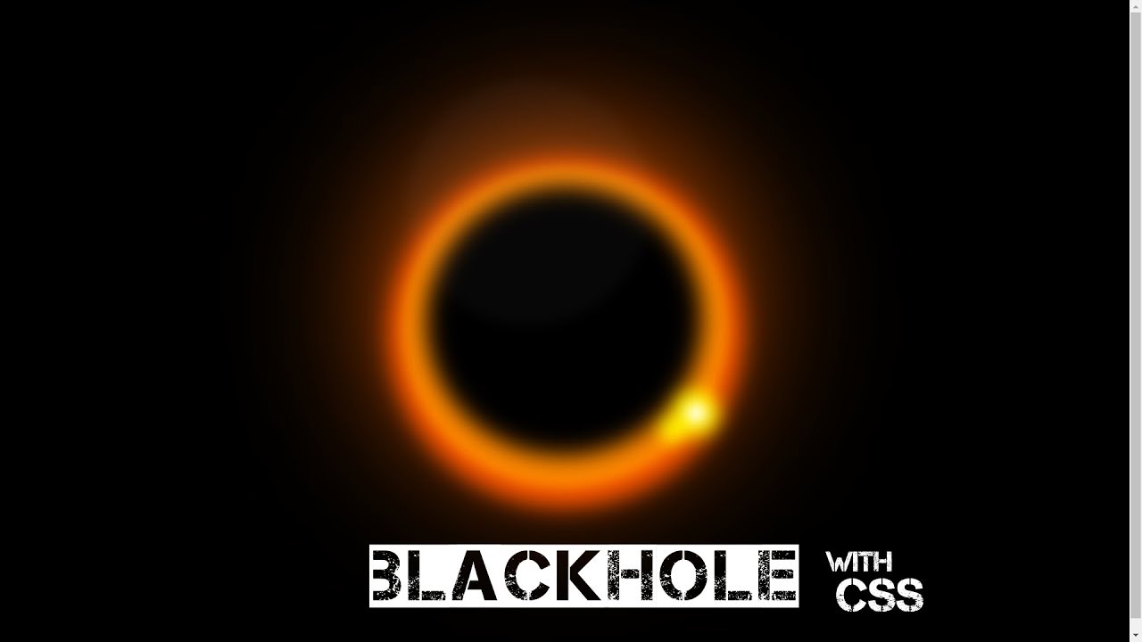
With the use of coding skill like
HTML (Hypertext Markup Language),
CSS (Cascading Style Sheets) you can do anything on your browser.
This is another kind of new way to express the power of coding. Here you can learn how to make “Black Hole”.
You just copy and paste into your code editor software and run it on your browser. You Don’t need to write manually it again. Just Copy & Paste.
If you don’t understand clearly so you can watch a youtube video which mentions the end of the page
HTML
<div></div>CSS
	<style>
		body {
  background: #000;
  display: grid;
  place-content: center;
  height: 100vh;
  filter: blur(8px);
}
div, div:before, div:after {
  display: block;
  border-radius: 50%;
}
div {
  width: 50vmin;
  height: 51vmin;
  box-shadow: 1vmin 0 3vmin 2vmin #f50,
       inset -1vmin 0 3vmin 4vmin #f80,
             -4vmin 0 35vmin 0 #f60;
  animation: bh 5s linear infinite;
}
@keyframes bh {
  0% {transform: rotate(0deg)}
  100% {transform: rotate(-360deg)}
}
div:before, div:after {
  content: "";
  background: white;
  position: relative;
  top: 6vmin;
}
div:before {
  width: 3vmin;
  height: 3vmin;
  left: 40vmin;
  box-shadow: yellow 0 0 2vmin 2vmin,
              yellow 2vmin 4vmin 2vmin 0.5vmin;
}
div:after {
  width: 38vmin;
  height: 38vmin;
  opacity: 0.03;
  left: -14vmin;
}
	</style>
YouTube
Read More 👇
Border To Underline Pure With HTML & CSS
Make Snowfall using CSS & JAVASCRIPT
Google Chrome Logo Rotate Pure With CSS
Snow Falling Effect Only With CSS
Social Media in a Book With CSS

[…] Black Hole Pure With CSS […]
[…] Black Hole Pure With CSS […]
[…] Black Hole Pure With CSS […]
[…] Black Hole Pure With CSS […]
[…] Black Hole Pure With CSS […]
[…] Black Hole Pure With CSS […]