With the use of coding skill like HTML & CSS, you can do anything on your browser.
This is another kind of new way to express the power of coding.
You just copy and paste into your code editor software and run it on your browser. You Don’t need to write manually it again. Just Copy & Paste.
If you don’t understand clearly so you can watch a youtube video which mentions the end of the page.
HTML
<body>
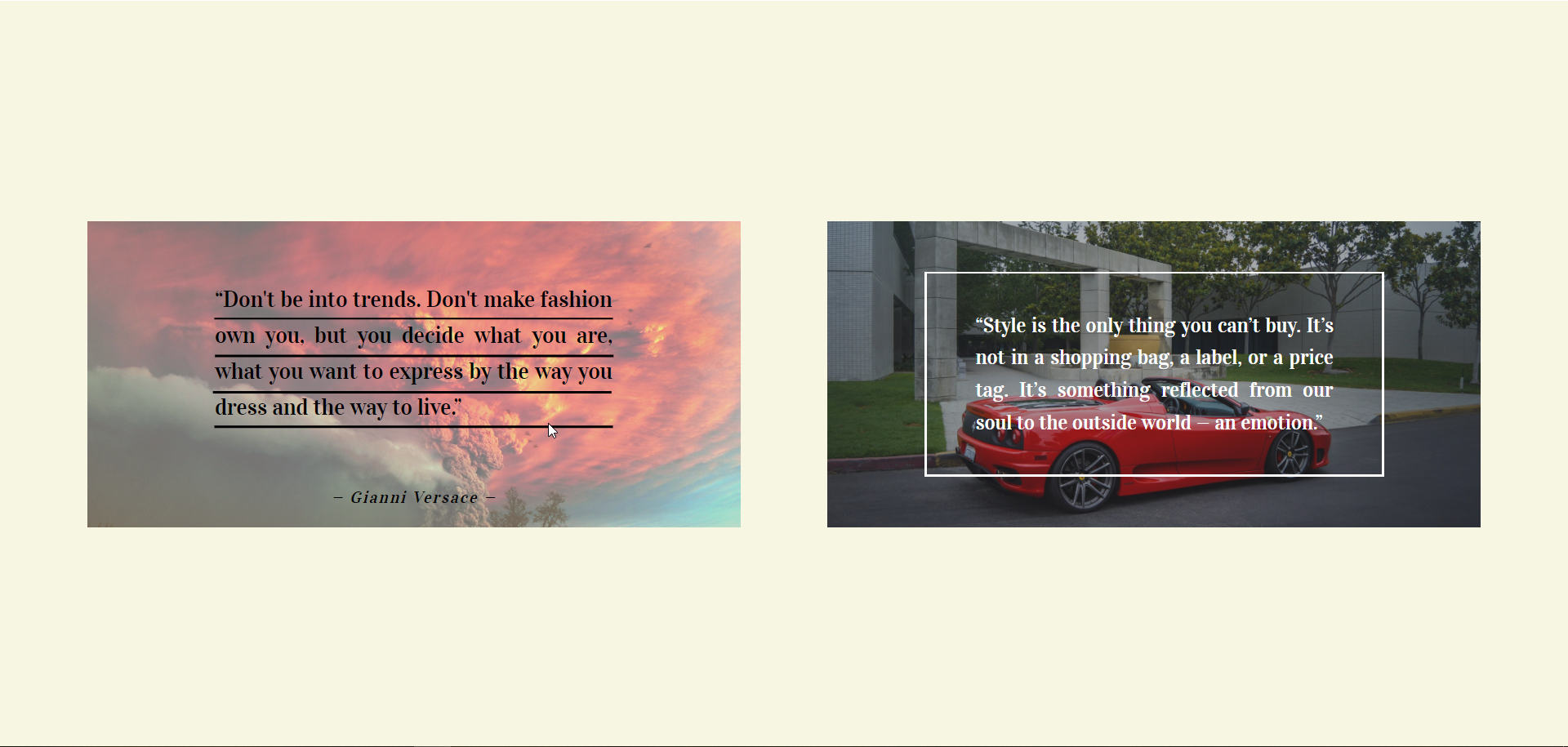
<figure class="card" tabindex="0">
<img class="card-image" src="C:\Users\Yashraj Patidar\Downloads\utorrent\40 Ultra HD 4K Computer Desktop Wallpapers - 5009 [ECLiPSE]\1.jpg" alt="">
<div class="box">
<div class="box-side-borders"></div>
<blockquote class="text">“Don't be into trends. Don't make fashion own you, but you decide what you are, what you want to express by the way you dress and the way to live.”</blockquote>
</div>
<figcaption>
<cite class="cite">— Gianni Versace —</cite>
</figcaption>
</figure>
<figure class="card dark" tabindex="0">
<img class="card-image" src="C:\Users\Yashraj Patidar\Downloads\utorrent\40 Ultra HD 4K Computer Desktop Wallpapers - 5009 [ECLiPSE]\15.jpg" alt="">
<div class="box">
<div class="box-side-borders"></div>
<blockquote class="text">“Style is the only thing you can’t buy. It’s not in a shopping bag, a label, or a price tag. It’s something reflected from our soul to the outside world — an emotion.”</blockquote>
</div>
<figcaption>
<cite class="cite">— Alber Elbaz —</cite>
</figcaption>
</figure>
</body>CSS
<style>
@import url('https://fonts.googleapis.com/css?family=Vidaloka');

body {
  font-family: 'Vidaloka', serif;
  height: 100vh;
  margin: 0;
  display: flex;
  flex-wrap: wrap;
  justify-content: space-evenly;
  align-items: center;
  background: #f7f6e3;
}
*, *::before, *::after {
  box-sizing: border-box;
}
.card {
  position: relative;
  display: block;
  width: 640px;
  height: 300px;
  margin: 0;
  margin-top: 50px;
  margin-bottom: 50px;
  color: black;
  display: flex;
  justify-content: center;
  align-items: center;
  overflow: hidden;
  outline: none;
  animation: slide-in 1s backwards;
}
.card:last-child {
  animation-delay: 0.4s;
}
@keyframes slide-in {
  from {
    opacity: 0;
    transform: translateY(30px);
  }
}
.card.dark {
  color: white;
}
.card.dark::before {
  background-image: radial-gradient(rgba(0, 0, 0, .8), rgba(0, 0, 0, .6) 50%, transparent), linear-gradient(to top, #00001f, #3580ac);
}
.card::before {
  content: "";
  position: absolute;
  z-index: -1;
  top: 0;
  left: 0;
  bottom: 0;
  right: 0;
  background-image: radial-gradient(rgba(255, 255, 255, .8), rgba(255, 255, 255, .6) 50%, transparent), linear-gradient(to bottom, #fff0e0, #fc9);
  opacity: 0.1;
  transition: 0.5s;
}
.card:hover::before, .card:focus::before {
  opacity: 0.4;
}
.box {
  width: 450px;
  padding: 30px;
  position: relative;
  font-size: 22px;
  line-height: 1.6;
  transition: 0.6s;
}
.card:hover .box, .card:focus .box {
  transform: translateY(-20px);
}
.text {
  margin: 0;
  transform: scale(0.9);
  transition: 0.5s;
  text-align: justify;
}
.card:hover .text, .card:focus .text {
  transform: none;
}
.cite {
  position: absolute;
  left: 50%;
  bottom: 0;
  transform: translate(-50%, 100%);
  transition: transform 0.2s 0.075s, letter-spacing 0.2s;
}
.card:hover .cite, .card:focus .cite {
  transition-delay: 0.5s, 0.575s;
  letter-spacing: 0.1em;
  transform: translate(-50%, -20px);
}
.box::before, .box-side-borders::before, .box::after, .box-side-borders::after {
  content: "";
  position: absolute;
  pointer-events: none;
  transition: 0.5s 0.1s;
  background: currentColor;
}
.box::before {
  top: 0;
  left: 0;
  width: 100%;
  height: 2px;
}
.box::after {
  bottom: 0;
  left: 0;
  width: 100%;
  height: 2px;
}
.card:hover .box::before, .card:focus .box::before {
  width: 390px;
  transform: translate(30px, calc(1.6em - .1em + 32px));
}
.card:hover .box::after, .card:focus .box::after {
  width: 390px;
  transform: translate(30px, calc(.1em - 30px));
}
.box-side-borders::before, .box-side-borders::after {
  transition: height 0.5s 0.1s, transform 0.4s 0.2s ease-in-out;
}
.box-side-borders::before {
  bottom: 0;
  left: 0;
  width: 2px;
  height: 100%;
  transform-origin: bottom;
}
.box-side-borders::after {
  top: 0;
  right: 0;
  width: 2px;
  height: 100%;
  transform-origin: top;
}
.card:hover .box-side-borders::before, .card:focus .box-side-borders::before, .card:hover .box-side-borders::after, .card:focus .box-side-borders::after {
  height: 390px;
  transition: transform 0.5s 0.1s, height 0.3s 0.3s ease-in-out;
}
.card:hover .box-side-borders::before, .card:focus .box-side-borders::before {
  transform: translate(30px, calc(-30px - 3.1em)) rotate(90deg);
}
.card:hover .box-side-borders::after, .card:focus .box-side-borders::after {
  transform: translate(-30px, calc(30px + 4.9em)) rotate(90deg);
}
.card-image {
  position: absolute;
  z-index: -2;
  top: 0;
  left: 0;
  width: 100%;
  height: 100%;
  object-fit: cover;
  transform-origin: 80% 20%;
  transition: 1s cubic-bezier(0.32, 0.16, 0, 1);
  filter: brightness(1.3) contrast(0.8);
}
.card.dark .card-image {
  filter: brightness(0.8) contrast(0.8);
}
.card:hover .card-image, .card:focus .card-image {
  transform: scale(1.05);
}

	</style>
Read More👇
Make Snowfall using CSS & JAVASCRIPT
Categories 👇
[…] Border To Underline Pure With HTML & CSS […]
[…] Border To Underline Pure With HTML & CSS […]
[…] Border To Underline Pure With HTML & CSS […]
[…] Border To Underline Pure With HTML & CSS […]
[…] Border To Underline Pure With HTML & CSS […]
[…] Border To Underline Pure With HTML & CSS […]
[…] Border To Underline Pure With HTML & CSS […]
[…] Border To Underline Pure With HTML & CSS […]
[…] Border To Underline Pure With HTML & CSS […]
[…] Border To Underline Pure With HTML & CSS […]
[…] Border To Underline Pure With HTML & CSS […]