With the use of coding skill like HTML, CSS you can do anything on your browser.
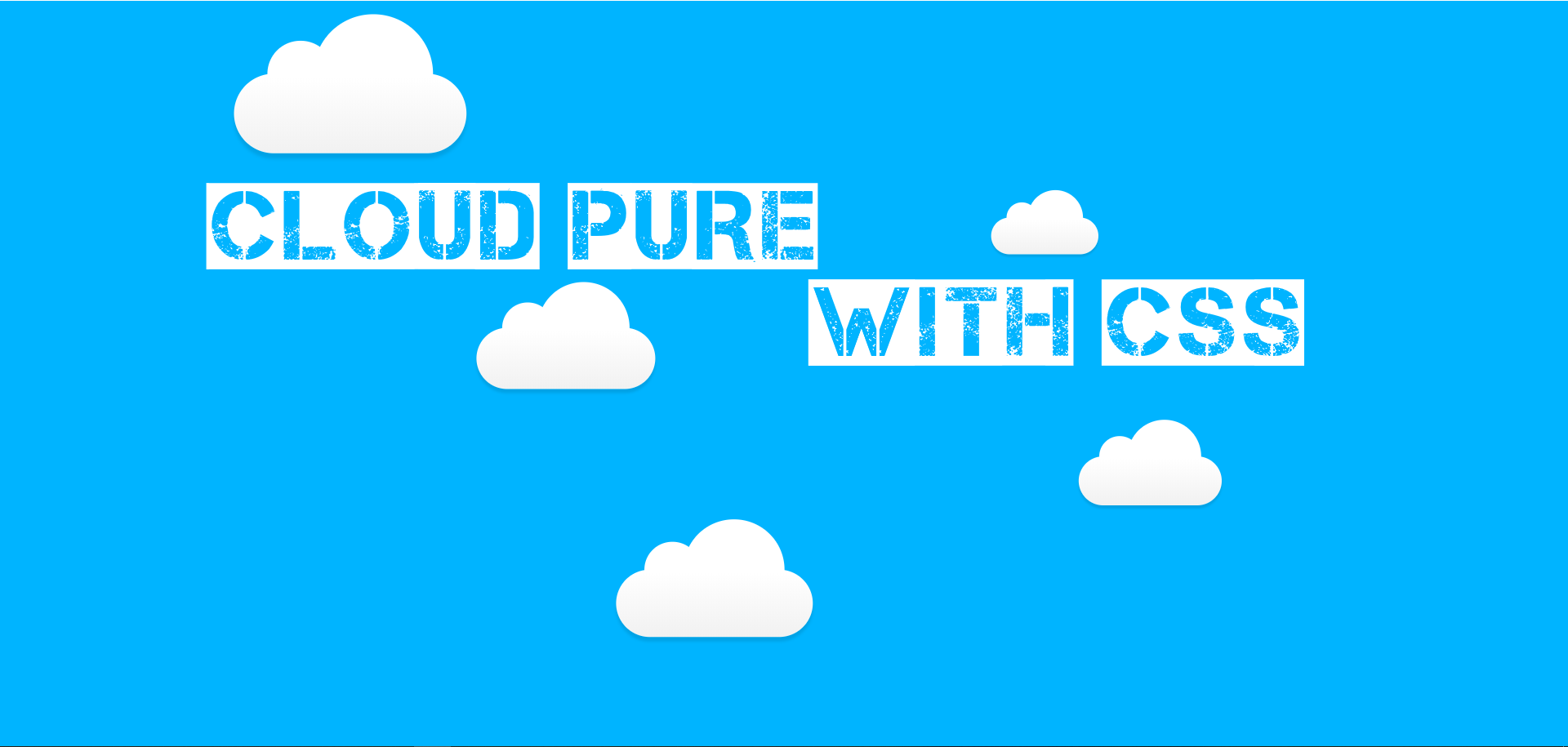
This is another kind of new way to express the power of coding. Here you can learn how to make “Cloud Pure With CSS”.
You just copy and paste into your code editor software and run it on your browser. You Don’t need to write manually it again. Just Copy & Paste.
If you don’t understand clearly so you can watch a youtube video which mentions the end of the page.
HTML
<div id="background-wrap">
    <div class="x1">
        <div class="cloud"></div>
    </div>

    <div class="x2">
        <div class="cloud"></div>
    </div>

    <div class="x3">
        <div class="cloud"></div>
    </div>

    <div class="x4">
        <div class="cloud"></div>
    </div>

    <div class="x5">
        <div class="cloud"></div>
    </div>
</div>
CSS
	<style type="text/css">
		body {
	background: #00b4ff;
	color: #333;
	font: 100% Arial, Sans Serif;
	height: 100vh;
	margin: 0;
	padding: 0;
	overflow-x: hidden;
}

#background-wrap {
    bottom: 0;
	left: 0;
	padding-top: 50px;
	position: fixed;
	right: 0;
	top: 0;
	z-index: -1;
}


/* OBJECTS */

.cloud {
	background: #fff;
	background: -moz-linear-gradient(top,  #fff 5%, #f1f1f1 100%);
	background: -webkit-gradient(linear, left top, left bottom, color-stop(5%,#fff), color-stop(100%,#f1f1f1));
	background: -webkit-linear-gradient(top,  #fff 5%,#f1f1f1 100%);
	background: -o-linear-gradient(top,  #fff 5%,#f1f1f1 100%);
	background: -ms-linear-gradient(top,  #fff 5%,#f1f1f1 100%);
	background: linear-gradient(top,  #fff 5%,#f1f1f1 100%);
	filter: progid:DXImageTransform.Microsoft.gradient( startColorstr='#fff', endColorstr='#f1f1f1',GradientType=0 );

	-webkit-border-radius: 100px;
	-moz-border-radius: 100px;
	border-radius: 100px;

	-webkit-box-shadow: 0 8px 5px rgba(0, 0, 0, 0.1);
	-moz-box-shadow: 0 8px 5px rgba(0, 0, 0, 0.1);
	box-shadow: 0 8px 5px rgba(0, 0, 0, 0.1);

	height: 120px;
	position: relative;
	width: 350px;
}

.cloud:after, .cloud:before {
    background: #fff;
	content: '';
	position: absolute;
	z-indeX: -1;
}

.cloud:after {
	-webkit-border-radius: 100px;
	-moz-border-radius: 100px;
	border-radius: 100px;

	height: 100px;
	left: 50px;
	top: -50px;
	width: 100px;
}

.cloud:before {
	-webkit-border-radius: 200px;
	-moz-border-radius: 200px;
	border-radius: 200px;

	width: 180px;
	height: 180px;
	right: 50px;
	top: -90px;
}

/* ANIMATIONS */

.x1 {
	-webkit-animation: animateCloud 35s linear infinite;
	-moz-animation: animateCloud 35s linear infinite;
	animation: animateCloud 35s linear infinite;

	-webkit-transform: scale(0.65);
	-moz-transform: scale(0.65);
	transform: scale(0.65);
}

.x2 {
	-webkit-animation: animateCloud 20s linear infinite;
	-moz-animation: animateCloud 20s linear infinite;
	animation: animateCloud 20s linear infinite;

	-webkit-transform: scale(0.3);
	-moz-transform: scale(0.3);
	transform: scale(0.3);
}

.x3 {
	-webkit-animation: animateCloud 30s linear infinite;
	-moz-animation: animateCloud 30s linear infinite;
	animation: animateCloud 30s linear infinite;

	-webkit-transform: scale(0.5);
	-moz-transform: scale(0.5);
	transform: scale(0.5);
}

.x4 {
	-webkit-animation: animateCloud 18s linear infinite;
	-moz-animation: animateCloud 18s linear infinite;
	animation: animateCloud 18s linear infinite;

	-webkit-transform: scale(0.4);
	-moz-transform: scale(0.4);
	transform: scale(0.4);
}

.x5 {
	-webkit-animation: animateCloud 25s linear infinite;
	-moz-animation: animateCloud 25s linear infinite;
	animation: animateCloud 25s linear infinite;

	-webkit-transform: scale(0.55);
	-moz-transform: scale(0.55);
	transform: scale(0.55);
}

/* KEYFRAMES */

@-webkit-keyframes animateCloud {
    0% {
        margin-left: -1000px;
    }
    100% {
        margin-left: 100%;
    }
}

@-moz-keyframes animateCloud {
    0% {
        margin-left: -1000px;
    }
    100% {
        margin-left: 100%;
    }
}

@keyframes animateCloud {
    0% {
        margin-left: -1000px;
    }
    100% {
        margin-left: 100%;
    }
}

	</style>
YouTube
READ MORE👇
Border To Underline Pure With HTML & CSS
Make Snowfall using CSS & JAVASCRIPT
Google Chrome Logo Rotate Pure With CSS
Categories 👇
[…] Cloud Pure With CSS […]
[…] Cloud Pure With CSS […]
[…] Cloud Pure With CSS […]
[…] Cloud Pure With CSS […]