With the use of coding skill like
HTML (Hypertext Markup Language),
CSS (Cascading Style Sheets) you can do anything on your browser.
This is another kind of new way to express the power of Frontend coding.
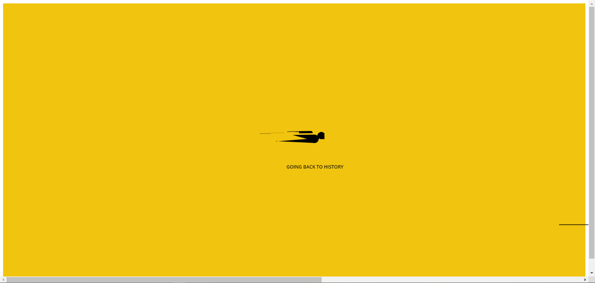
Here you can learn “Going Back to History- LODER Pure through CSS ”.
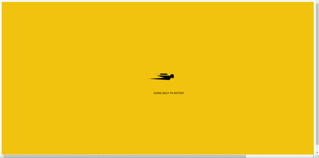
You just copy and paste into your code editor software and run it on your browser. You Don’t need to write manually it again. Just Copy & Paste.
If you don’t understand clearly so you can watch youtube videos which mention at the end of the page.
HTML
<div class="ani-loder">
   <div class='body'>
     <span>
       <span></span>
       <span></span>
       <span></span>
       <span></span>
     </span>
   <div class='base'>
    <span></span>
    <div class='face'></div>
  </div>
</div>
<div class='longfazers'>
  <span></span>
  <span></span>
  <span></span>
  <span></span>
</div>
<h1>Going Back to History</h1>
 </div>
CSS
*,
*::after,
*::before{

}

@import url(https://fonts.googleapis.com/css?family=Open+Sans:300);


.ani-loder{
  height:100vh;
  background-color: #f1c40f;
  overflow: hidden;
}

.ani-loder h1 {
  position: absolute;
  font-family: 'Open Sans';
  font-weight: 600;
  font-size: 12px;
  text-transform: uppercase;
  left: 50%;
  top: 58%;
  margin-left: -20px;
}

.body {
  position: absolute;
  top: 50%;
  margin-left: -50px;
  left: 50%;
  animation: speeder .4s linear infinite;
}
.body > span {
  height: 5px;
  width: 35px;
  background: #000;
  position: absolute;
  top: -19px;
  left: 60px;
  border-radius: 2px 10px 1px 0;
}

.base span {
  position: absolute;
  width: 0;
  height: 0;
  border-top: 6px solid transparent;
  border-right: 100px solid #000;
  border-bottom: 6px solid transparent;
}
.base span:before {
  content: "";
  height: 22px;
  width: 22px;
  border-radius: 50%;
  background: #000;
  position: absolute;
  right: -110px;
  top: -16px;
}
.base span:after {
  content: "";
  position: absolute;
  width: 0;
  height: 0;
  border-top: 0 solid transparent;
  border-right: 55px solid #000;
  border-bottom: 16px solid transparent;
  top: -16px;
  right: -98px;
}

.face {
  position: absolute;
  height: 12px;
  width: 20px;
  background: #000;
  border-radius: 20px 20px 0 0;
  transform: rotate(-40deg);
  right: -125px;
  top: -15px;
}
.face:after {
  content: "";
  height: 12px;
  width: 12px;
  background: #000;
  right: 4px;
  top: 7px;
  position: absolute;
  transform: rotate(40deg);
  transform-origin: 50% 50%;
  border-radius: 0 0 0 2px;
}

.body > span > span:nth-child(1),
.body > span > span:nth-child(2),
.body > span > span:nth-child(3),
.body > span > span:nth-child(4) {
  width: 30px;
  height: 1px;
  background: #000;
  position: absolute;
  animation: fazer1 .2s linear infinite;
}

.body > span > span:nth-child(2) {
  top: 3px;
  animation: fazer2 .4s linear infinite;
}

.body > span > span:nth-child(3) {
  top: 1px;
  animation: fazer3 .4s linear infinite;
  animation-delay: -1s;
}

.body > span > span:nth-child(4) {
  top: 4px;
  animation: fazer4 1s linear infinite;
  animation-delay: -1s;
}

@keyframes fazer1 {
  0% {
    left: 0;
  }
  100% {
    left: -80px;
    opacity: 0;
  }
}
@keyframes fazer2 {
  0% {
    left: 0;
  }
  100% {
    left: -100px;
    opacity: 0;
  }
}
@keyframes fazer3 {
  0% {
    left: 0;
  }
  100% {
    left: -50px;
    opacity: 0;
  }
}
@keyframes fazer4 {
  0% {
    left: 0;
  }
  100% {
    left: -150px;
    opacity: 0;
  }
}
@keyframes speeder {
  0% {
    transform: translate(2px, 1px) rotate(0deg);
  }
  10% {
    transform: translate(-1px, -3px) rotate(-1deg);
  }
  20% {
    transform: translate(-2px, 0px) rotate(1deg);
  }
  30% {
    transform: translate(1px, 2px) rotate(0deg);
  }
  40% {
    transform: translate(1px, -1px) rotate(1deg);
  }
  50% {
    transform: translate(-1px, 3px) rotate(-1deg);
  }
  60% {
    transform: translate(-1px, 1px) rotate(0deg);
  }
  70% {
    transform: translate(3px, 1px) rotate(-1deg);
  }
  80% {
    transform: translate(-2px, -1px) rotate(1deg);
  }
  90% {
    transform: translate(2px, 1px) rotate(0deg);
  }
  100% {
    transform: translate(1px, -2px) rotate(-1deg);
  }
}
.longfazers {
  position: absolute;
  width: 100%;
  height: 100%;
}
.longfazers span {
  position: absolute;
  height: 2px;
  width: 20%;
  background: #000;
}
.longfazers span:nth-child(1) {
  top: 20%;
  animation: lf .6s linear infinite;
  animation-delay: -5s;
}
.longfazers span:nth-child(2) {
  top: 40%;
  animation: lf2 .8s linear infinite;
  animation-delay: -1s;
}
.longfazers span:nth-child(3) {
  top: 60%;
  animation: lf3 .6s linear infinite;
}
.longfazers span:nth-child(4) {
  top: 80%;
  animation: lf4 .5s linear infinite;
  animation-delay: -3s;
}

@keyframes lf {
  0% {
    left: 200%;
  }
  100% {
    left: -200%;
    opacity: 0;
  }
}
@keyframes lf2 {
  0% {
    left: 200%;
  }
  100% {
    left: -200%;
    opacity: 0;
  }
}
@keyframes lf3 {
  0% {
    left: 200%;
  }
  100% {
    left: -100%;
    opacity: 0;
  }
}
@keyframes lf4 {
  0% {
    left: 200%;
  }
  100% {
    left: -100%;
    opacity: 0;
  }
}
YouTube
Read More
- SanDisk Pro SSD 1TB Review
- Universe Sandbox Download Free for PC
- GTA 5 cheats: Full list of GTA 5 cheat codes for PC, PS4, Xbox consoles in PDF FORM
- Fonts Pack10000 Download for PC Free
- Oneplus 10 Pro Specification