With the use of coding skill like HTML & CSS, you can do anything on your browser.
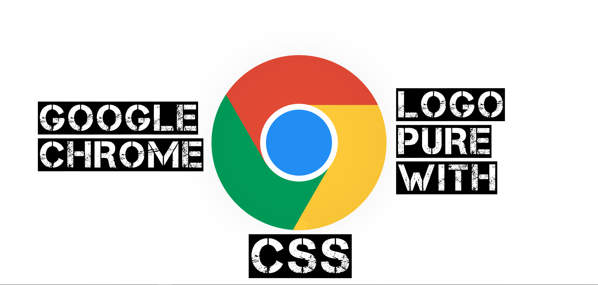
This is another kind of new way to express the power of coding. Here you can learn “Google Chrome Logo Rotate Pure With CSS”.
You just copy and paste into your code editor software and run it on your browser. You Don’t need to write manually it again. Just Copy & Paste.
If you don’t understand clearly so you can watch a youtube video which mentions the end of the page.
HTML
<div class="chrome-logo"></div>Google Chrome Logo Rotate Pure With CSS 👇 Watch This 👇
— YashRaj (@yashrajpatidar1) April 26, 2019
Link: https://t.co/pb836bETgN
Like Facebook Page: https://t.co/dZFehqnNY7
Copy Coding: https://t.co/GTkwA7Jk92#html#css#javascript#coding#coding_lover#frontEnd#frontend_developer#frontend_coding pic.twitter.com/09hTzYRkr5
CSS
<style type="text/css">
body {
  font-size: 6px;
}

.chrome-logo {
  display: block;
  width: 28.125em;
  height: 28.125em;
  position: absolute;
  top: 50%;
  left: 50%;
  margin-top: -14.0625em;
  margin-left: -14.0625em;
  border-radius: 28.125em;
  background-image: linear-gradient(240deg, transparent 66.4%, #009c59 0%, #009c59), linear-gradient(0deg, transparent 71.5%, #e34a35 0%, #e34a35), linear-gradient(290deg, transparent 60%, #e34a35 0%, #e34a35), linear-gradient(120deg, transparent 66%, #ffca38 0%, #ffca38), linear-gradient(57deg, transparent 58%, #ffca38 0%, #ffca38), linear-gradient(190deg, transparent 58%, #009c59 0%, #009c59);
  box-shadow: inset 0 0 10em rgba(0, 0, 0, 0.05), 0 0 100px rgba(0, 0, 0, 0.05), 0 0 10px rgba(255, 255, 255, 1);
  transition: all 1s cubic-bezier(0.4, 0, 0.2, 1);
  overflow: hidden;
}
.chrome-logo::before, .chrome-logo::after {
  content: '';
  display: block;
}
.chrome-logo::before {
  width: 1.75em;
  height: 2.375em;
  position: absolute;
  top: 26.4375em;
  left: 13.4375em;
  border-bottom-right-radius: 14.0625em;
  background-color: #ffca38;
  transform: rotate(30deg);
}
.chrome-logo::after {
  width: 10.625em;
  height: 10.625em;
  position: absolute;
  top: 50%;
  left: 50%;
  margin-top: -5.3125em;
  margin-left: -5.3125em;
  border-radius: 14.0625em;
  background-color: #228ef4;
  box-shadow: 0 0 0 0.9375em rgba(255, 255, 255, 1);
}
.chrome-logo:hover {
  transform: rotate(-720deg) scale(0.9);
}
@media only screen and (min-width: 480px) {
  body {
    font-size: 10px;
  }
}
@media only screen and (min-width: 800px) {
  body {
    font-size: 16px;
  }
}
</style>
YouTube
HTML CSS JavaScript Coding
HTML CSS JavaScript Coding. 65 likes. Here you can enjoy videos about coding Like HTML CSS and JavaScript to build a stunning WebSite.
Read More👇
Make Snowfall using CSS & JAVASCRIPT
Border To Underline Pure With HTML & CSS
Categories 👇
[…] Google Chrome Logo Rotate Pure With CSS […]
[…] Google Chrome Logo Rotate Pure With CSS […]
[…] Google Chrome Logo Rotate Pure With CSS […]
[…] Google Chrome Logo Rotate Pure With CSS […]
[…] Google Chrome Logo Rotate Pure With CSS […]
[…] Google Chrome Logo Rotate Pure With CSS […]
[…] Google Chrome Logo Rotate Pure With CSS […]
[…] Google Chrome Logo Rotate Pure With CSS […]