With the use of coding skill like
HTML (Hypertext Markup Language),
CSS (Cascading Style Sheets) you can do anything on your browser.
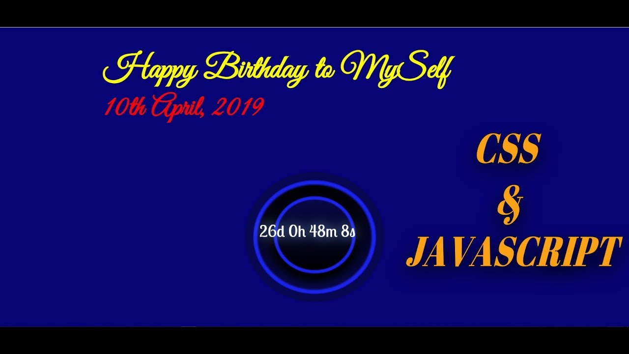
This is another kind of new way to express the power of Front end coding. Here you can learn how to make “Happy Birthday – CountDown ”.
You just copy and paste into your code editor software and run it on your browser. You Don’t need to write manually it again. Just Copy & Paste.
If you don’t understand clearly so you can watch a youtube video which mentions the end of the page.
There are two videos. In the first video, you can see the “How to make countdown” then next video you can see “How to make Firework”.
HTML
<h1>Happy Birthday<br> Mr. Yashraj Patidar<span>10th April, 2019</span></h1>

<div class="container">
  <div class="rim"></div>
  <div class="outer"></div>
  <div class="inner"></div>
  <div id="clock"></div>

</div>

<canvas id="birthday"></canvas>
CSS
@import url('https://fonts.googleapis.com/css?family=Lobster');
@import url('https://fonts.googleapis.com/css?family=Great+Vibes&subset=latin-ext');
body {
  margin: 0;
  cursor: crosshair;
}

.container {
  position: absolute;
  top: 70%;
  left: 50%;
  transform: translate(-50%, -50%);
}

.rim {
  position: absolute;
  top: 70%;
  left: 50%;
  transform: translate(-50%, -50%);
  width: 300px;
  height: 300px;
  border: 20px solid rgba(8,8,71,0.8);
  border-radius: 50%;
  animation: shift-rim 8s infinite;
  z-index: 10;
}

.outer {
  width: 300px;
  height: 300px;
  background: linear-gradient(to bottom, rgba(0,0,0,1) 0%, rgba(8,8,71,1) 100%);
  border: 10px solid #1A23F2;
  border-radius: 50%;
  box-sizing: border-box;
  filter: blur(2px);
  animation: shift 8s infinite;
  &::before {
    display: block;
    content: '';
    position: absolute;
    top: 50%;
    left: 50%;
    transform: translate(-50%, -50%);
    width: 104%;
    height: 104%;
    border: 1px solid #fff;
    box-sizing: border-box;
    border-radius: 50%;
    opacity: 1;
    filter: blur(2px);
  }
}

.inner {
  position: absolute;
  top: -10px;
  left: 50%;
  transform: translateX(-50%);
  width: 200px;
  height: 200px;
  background: linear-gradient(to bottom, rgba(8,8,71,1) 0%, rgba(0,0,0,1) 100%);
  border: 8px solid #1A23F2;
  border-radius: 50%;
  box-sizing: border-box;
  box-shadow: 0 10px 20px 10px #000;
  filter: blur(1px);
  animation: shift-inner 8s infinite;
    &::before {
    display: block;
    content: '';
    position: absolute;
    top: 50%;
    left: 50%;
    transform: translate(-50%, -50%);
    width: 100%;
    height: 100%;
    border: 8px solid #000;
    box-sizing: border-box;
    border-radius: 50%;
    opacity: 1;
    filter: blur(5px);
  }
   &::after {
    display: block;
    content: '';
    position: absolute;
    top: 50%;
    left: 50%;
    transform: translate(-50%, -50%);
    width: 105%;
    height: 105%;
    border: 1px solid #6AAEE9;
    box-sizing: border-box;
    border-radius: 50%;
    opacity: 1;
    filter: blur(3px);
  }
}

#clock {
  position: absolute;
  top: -15px;
  left: 50%;
  transform: translateX(-50%);
  width: 90%;
  height: 50px;
  color: #fff;
  font-family: 'Lobster', cursive;
  font-size: 40px;
  text-align: center;
  text-shadow: 0 0 30px #8DCAED;
  animation: shift-clock 8s infinite;
}

@keyframes shift {
  0% {
    height: 100px;
  }
  50% {
    height: 280px;
  }
  100% {
    height: 100px;
  }
}

@keyframes shift-rim {
  0% {
    top: 40%;
    height: 100px;
  }
  50% {
    top: 50%;
    height: 280px;
  }
  100% {
    top: 40%;
    height: 100px;
  }
}

@keyframes shift-inner {
  0% {
    top: -10px;
    height: 50px;
  }
  50% {
    top: 40px;
    height: 190px;
  }
  100% {
    top: -10px;
    height: 50px;
  }
}

@keyframes shift-clock {
  0% {
    top: -10px;
    transform: translateX(-50%) scaleY(.2);
  }
  50% {
    top: 100px;
    transform: translateX(-50%) scaleY(1);
  }
  100% {
    top: -10px;
    transform: translateX(-50%) scaleY(.2);
  }
}
h1 {
  position: absolute;
  color: yellow;
  font-family: 'Great Vibes', cursive;
  font-size: 5em;
  font-weight: 900;
  user-select: none;
  animation:animate 6s linear infinite;
}
span{
  display: block;
  font-size: 70px;
  font-family: 'Great Vibes', cursive;
  color:red;
}

@keyframes animate {
  0%{
    transform:translateX(-500px);
  }
  100%{
    transform: translateX(1650px);
  }
}

canvas{display:block}
JAVASCRIPT
<script>
// Set the date we're counting down to
var countDownDate = new Date("apr 10, 2019 09:30:00").getTime();

// Update the count down every 1 second
var x = setInterval(function() {

    // Get todays date and time
    var now = new Date().getTime();

    // Find the distance between now and the count down date
    var distance = countDownDate - now;

    // Time calculations for days, hours, minutes and seconds
    var days = Math.floor(distance / (1000 * 60 * 60 * 24));
    var hours = Math.floor((distance % (1000 * 60 * 60 * 24)) / (1000 * 60 * 60));
    var minutes = Math.floor((distance % (1000 * 60 * 60)) / (1000 * 60));
    var seconds = Math.floor((distance % (1000 * 60)) / 1000);

    // Output the result in an element with id="clock"
    document.getElementById("clock").innerHTML = days + "d " + hours + "h "
    + minutes + "m " + seconds + "s ";

    // If the count down is over, write some text
    if (distance < 0) {
        clearInterval(x);
        document.getElementById("clock").innerHTML = "EXPIRED";
    }
}, 1000);


// helper functions
const PI2 = Math.PI * 2
const random = (min, max) => Math.random() * (max - min + 1) + min | 0
const timestamp = _ => new Date().getTime()

// container
class Birthday {
  constructor() {
    this.resize()

    // create a lovely place to store the firework
    this.fireworks = []
    this.counter = 0

  }

  resize() {
    this.width = canvas.width = window.innerWidth
    let center = this.width / 2 | 0
    this.spawnA = center - center / 4 | 0
    this.spawnB = center + center / 4 | 0

    this.height = canvas.height = window.innerHeight
    this.spawnC = this.height * .1
    this.spawnD = this.height * .5

  }

  onClick(evt) {
     let x = evt.clientX || evt.touches && evt.touches[0].pageX
     let y = evt.clientY || evt.touches && evt.touches[0].pageY

     let count = random(3,5)
     for(let i = 0; i < count; i++) this.fireworks.push(new Firework(
        random(this.spawnA, this.spawnB),
        this.height,
        x,
        y,
        random(0, 260),
        random(30, 110)))

     this.counter = -1

  }

  update(delta) {
    ctx.globalCompositeOperation = 'hard-light'
    ctx.fillStyle = `rgba(20,20,20,${ 7 * delta })`
    ctx.fillRect(0, 0, this.width, this.height)

    ctx.globalCompositeOperation = 'lighter'
    for (let firework of this.fireworks) firework.update(delta)

    // if enough time passed... create new new firework
    this.counter += delta * 3 // each second
    if (this.counter >= 1) {
      this.fireworks.push(new Firework(
        random(this.spawnA, this.spawnB),
        this.height,
        random(0, this.width),
        random(this.spawnC, this.spawnD),
        random(0, 360),
        random(30, 110)))
      this.counter = 0
    }

    // remove the dead fireworks
    if (this.fireworks.length > 1000) this.fireworks = this.fireworks.filter(firework => !firework.dead)

  }
}

class Firework {
  constructor(x, y, targetX, targetY, shade, offsprings) {
    this.dead = false
    this.offsprings = offsprings

    this.x = x
    this.y = y
    this.targetX = targetX
    this.targetY = targetY

    this.shade = shade
    this.history = []
  }
  update(delta) {
    if (this.dead) return

    let xDiff = this.targetX - this.x
    let yDiff = this.targetY - this.y
    if (Math.abs(xDiff) > 3 || Math.abs(yDiff) > 3) { // is still moving
      this.x += xDiff * 2 * delta
      this.y += yDiff * 2 * delta

      this.history.push({
        x: this.x,
        y: this.y
      })

      if (this.history.length > 20) this.history.shift()

    } else {
      if (this.offsprings && !this.madeChilds) {

        let babies = this.offsprings / 2
        for (let i = 0; i < babies; i++) {
          let targetX = this.x + this.offsprings * Math.cos(PI2 * i / babies) | 0
          let targetY = this.y + this.offsprings * Math.sin(PI2 * i / babies) | 0

          birthday.fireworks.push(new Firework(this.x, this.y, targetX, targetY, this.shade, 0))

        }

      }
      this.madeChilds = true
      this.history.shift()
    }

    if (this.history.length === 0) this.dead = true
    else if (this.offsprings) {
        for (let i = 0; this.history.length > i; i++) {
          let point = this.history[i]
          ctx.beginPath()
          ctx.fillStyle = 'hsl(' + this.shade + ',100%,' + i + '%)'
          ctx.arc(point.x, point.y, 1, 0, PI2, false)
          ctx.fill()
        }
      } else {
      ctx.beginPath()
      ctx.fillStyle = 'hsl(' + this.shade + ',100%,50%)'
      ctx.arc(this.x, this.y, 1, 0, PI2, false)
      ctx.fill()
    }

  }
}

let canvas = document.getElementById('birthday')
let ctx = canvas.getContext('2d')

let then = timestamp()

let birthday = new Birthday
window.onresize = () => birthday.resize()
document.onclick = evt => birthday.onClick(evt)
document.ontouchstart = evt => birthday.onClick(evt)

  ;(function loop(){
  	requestAnimationFrame(loop)

  	let now = timestamp()
  	let delta = now - then

    then = now
    birthday.update(delta / 1000)


  })()
</script>
YouTube
Read More👇
Border To Underline Pure With HTML & CSS
Make Snowfall using CSS & JAVASCRIPT
Google Chrome Logo Rotate Pure With CSS
Snow Falling Effect Only With CSS
Social Media in a Book With CSS
[…] Happy Birthday – CountDown [CSS & JavaScript] […]