With the use of coding skill like HTML & CSS, you can do anything on your browser.
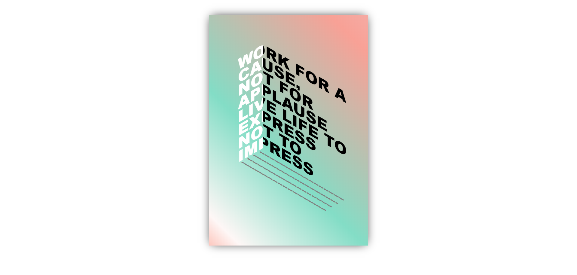
This is another kind of new way to express the power of coding. Here you can find coding for Book Cover Page With CSS
You just copy and paste into your code editor software and run it on your browser. You Don’t need to write manually it again. Just Copy & Paste.
If you don’t understand clearly so you can watch a youtube video which mentions the
HTML
<section class="poster">
	<div class="left">Work For A</div>
	<div class="right">Work For A</div>
	<div class="left">CAUSE,</div>
	<div class="right">CAUSE,</div>
	<div class="left">NOT FOR</div>
	<div class="right">NOT FOR</div>
	<div class="left">APPLAUSE</div>
	<div class="right">APPLAUSE</div>
	<div class="left">LIVE LIFE TO</div>
	<div class="right">LIVE LIFE TO</div>
	<div class="left">EXPRESS</div>
	<div class="right">EXPRESS</div>
	<div class="left">NOT TO</div>
	<div class="right">NOT TO</div>
	<div class="left">IMPRESS</div>
	<div class="right">IMPRESS</div>
	<div></div>
	<div class="last">
		<div>---------------------------------</div>
		<div>---------------------------------</div>
		<div>---------------------------------</div>
		<div>---------------------------------</div>
	</div>
</section>- SanDisk Pro SSD 1TB Review
- Universe Sandbox Download Free for PC
- GTA 5 cheats: Full list of GTA 5 cheat codes for PC, PS4, Xbox consoles in PDF FORM
- Fonts Pack10000 Download for PC Free
- Oneplus 10 Pro Specification
CSS
.poster{
			background: linear-gradient(45deg, rgba(253,200,191,1) 0%, rgba(254,247,246,1) 8%, rgba(131,221,198,1) 40%, rgba(220,175,162,1) 78%, rgba(248,161,150,1) 90%, rgba(245,170,163,1) 100%);
			box-shadow: 0 0 2rem -0.5rem rgba(0,0,0,0.9);
			box-sizing: border-box;
			display: grid;
			font-family: Arial, sans-serif;
			font-weight: 800;
			font-size: 3.15rem;
			grid-template-columns: 5.25rem 18rem;
			height: 48rem;
			line-height: 0.8;
			margin: 3rem auto;
			padding:6rem 6rem 14rem;
			text-transform: uppercase;
			white-space: nowrap;
			width: 33rem;
		}
.left{
			animation:slideleft 3s linear;
			color: white;
			overflow: hidden;
			transform: skewY(-30deg);
			transform-origin: top right;
		}
.right{
			animation:slideright 3s linear;
			color: black;
			overflow: hidden;
			text-indent: -5.25rem;
			transform: skewY(30deg);
			transform-origin: top left;

		}
.last{
			color: gray;
			font-size: 1.6rem;
			line-height: 0.9;
			overflow: hidden;
			text-indent: 0;
			transform: skewY(30deg) skewX(-41deg);
			transform-origin: top left;
			animation: slidebottom 3s linear reverse;
		}
@keyframes slideleft {
             0%{text-indent: -23.25rem;}
             100%{text-indent: 0;}
		}
@keyframes slidebottom{
			from{color:black;}
			to{color: gray;}
			0%{text-indent: -18rem;}
			25%{text-indent: -18rem;}
			100%{text-indent: 0;}
		}
@keyframes slideright {
			0%{text-indent: -28.5rem;}
			100%{text-indent: -5.25rem;}

		}
Like!! Great article post.Really thank you! Really Cool.
Like!! Thank you for publishing this awesome article.