With the use of coding skill like
HTML (Hypertext Markup Language),
CSS (Cascading Style Sheets) you can do anything on your browser.
This is another kind of new way to express the power of Frontend coding.
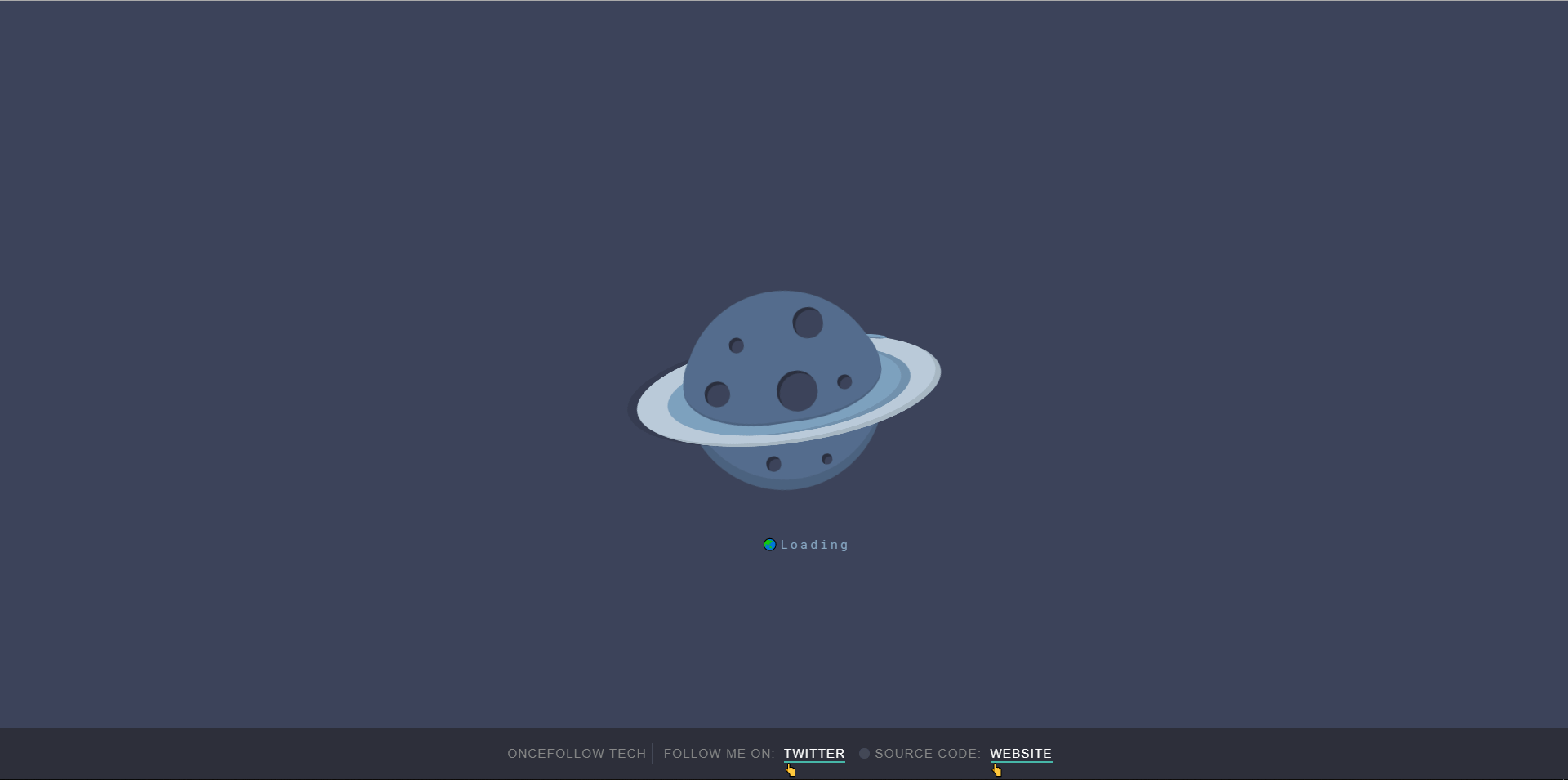
Here you can learn “UFO Loader Pure With CSS ”.

You just copy and paste into your code editor software and run it on your browser. You Don’t need to write manually it again. Just Copy & Paste.
If you don’t understand clearly so you can watch youtube videos which mention at the end of the page.
HTML
<div class="content">
   <div class="planet">
      <div class="ring"></div>
         <div class="cover-ring"></div>
      <div class="spots">
         <span></span>
         <span></span>
         <span></span>
         <span></span>
         <span></span>
         <span></span>
         <span></span>

      </div>
   </div>
   <p>🌏Loading</p>
</div>

<div class="about">OnceFollow TEch
 <span class="one"></span>
  Follow me on: <a href="https://twitter.com/yashrajpatidar1" target="_blank">Twitter</a>
  <span class="two"></span>
  Source Code:<a href="https://Oncefollow.com/tech" target="_blank">WebSite</a>
</div>- Looking Like A Book Cover Page with CSS
- Make Snowfall using CSS & JAVASCRIPT
- Border To Underline Pure With HTML & CSS
- Google Chrome Logo Rotate Pure With CSS
- Cloud Pure With CSS
CSS
@import url("https://fonts.googleapis.com/css?family=Roboto+Mono&display=swap");

body {
  margin: 0;
  padding: 0;
  display: flex;
  align-items: center;
  justify-content: center;
  height: 100vh;
  width: 100%;
  background-color: #3c4359;
}
.content {
  width: 300px;
  height: 300px;
  position: relative;
  display: flex;
  justify-content: center;
  align-items: center;
}
.content .planet {
  width: 65%;
  height: 65%;
  background-color: #546c8c;
  border-radius: 100%;
  position: absolute;
  display: flex;
  align-items: center;
  transform-origin: center center;
  box-shadow: inset 2px -10px 0px rgba(0, 0, 0, 0.1);
  animation: planet 5s ease infinite alternate;
  /* planet ring */
  /* to cover the back of the ring */
  /* planet spots */
}
@keyframes planet {
  0% {
    transform: rotate(10deg);
  }
  100% {
    transform: rotate(-10deg);
  }
}
.content .planet .ring {
  position: absolute;
  width: 300px;
  height: 300px;
  border-radius: 100%;
  background-color: #bacbd9;
  display: flex;
  align-items: center;
  justify-content: center;
  transform-origin: 33% center;
  box-shadow: 2px -10px 0px rgba(0, 0, 0, 0.1), inset -5px -10px 0px rgba(0, 0, 0, 0.1);
  animation: ring 3s ease infinite;
  /* small ball */
  /* inner ring */
}
@keyframes ring {
  0% {
    transform: rotateX(110deg) rotateZ(0deg) translate(-50px, 5px);
  }
  100% {
    transform: rotateX(110deg) rotateZ(360deg) translate(-50px, 5px);
  }
}
.content .planet .ring:before {
  content: "";
  position: absolute;
  width: 10px;
  height: 30px;
  border-radius: 100%;
  background-color: #7ea1bf;
  z-index: 2;
  left: calc(0px - 5px);
  box-shadow: inset -3px 3px 0px rgba(0, 0, 0, 0.2);
}
.content .planet .ring:after {
  content: "";
  position: absolute;
  width: 240px;
  height: 240px;
  border-radius: 100%;
  background-color: #7ea1bf;
  box-shadow: inset 2px -10px 0px rgba(0, 0, 0, 0.1);
}
.content .planet .cover-ring {
  position: absolute;
  width: 100%;
  height: 50%;
  border-bottom-left-radius: 80%;
  border-bottom-right-radius: 80%;
  border-top-left-radius: 100px;
  border-top-right-radius: 100px;
  transform: translate(0px, -17px);
  background-color: #546c8c;
  z-index: 2;
  box-shadow: inset 0px -2px 0px rgba(0, 0, 0, 0.1);
}
.content .planet .spots {
  width: 100%;
  height: 100%;
  display: flex;
  align-items: center;
  justify-content: center;
  position: absolute;
  z-index: 2;
}
.content .planet .spots span {
  width: 30px;
  height: 30px;
  background-color: #3c4359;
  position: absolute;
  border-radius: 100%;
  box-shadow: inset -2px 3px 0px rgba(0, 0, 0, 0.3);
  animation: dots 5s ease infinite alternate;
}
@keyframes dots {
  0% {
    box-shadow: inset -3px 3px 0px rgba(0, 0, 0, 0.3);
  }
  100% {
    box-shadow: inset 3px 3px 0px rgba(0, 0, 0, 0.3);
  }
}
.content .planet .spots span:nth-child(1) {
  top: 20px;
  right: 50px;
}
.content .planet .spots span:nth-child(2) {
  top: 40px;
  left: 50px;
  width: 15px;
  height: 15px;
}
.content .planet .spots span:nth-child(3) {
  top: 80px;
  left: 20px;
  width: 25px;
  height: 25px;
}
.content .planet .spots span:nth-child(4) {
  top: 80px;
  left: 90px;
  width: 40px;
  height: 40px;
}
.content .planet .spots span:nth-child(5) {
  top: 160px;
  left: 70px;
  width: 15px;
  height: 15px;
}
.content .planet .spots span:nth-child(6) {
  top: 165px;
  left: 125px;
  width: 10px;
  height: 10px;
}
.content .planet .spots span:nth-child(7) {
  top: 90px;
  left: 150px;
  width: 15px;
  height: 15px;
}
.content p {
  color: #bacbd9;
  font-size: 12px;
  z-index: 2;
  position: absolute;
  bottom: -20px;
  font-family: "Roboto Mono", monospace;
  animation: text 4s ease infinite;
  width: 100px;
  text-align: center;
}
@keyframes text {
  0% {
    transform: translateX(-30px);
    letter-spacing: 0px;
    color: #bacbd9;
  }
  25% {
    letter-spacing: 3px;
    color: #7ea1bf;
  }
  50% {
    transform: translateX(30px);
    letter-spacing: 0px;
    color: #bacbd9;
  }
  75% {
    letter-spacing: 3px;
    color: #7ea1bf;
  }
  100% {
    transform: translateX(-30px);
    letter-spacing: 0px;
    color: #bacbd9;
  }
}

.about {
  background-color: #2c303a;
  width: 100%;
  min-width: 480px;
  height: 50px;
  position: fixed;
  bottom: 0;
  color: #888;
  display: flex;
  justify-content: center;
  align-items: center;
  font-family: "Rubik", sans-serif;
  text-transform: uppercase;
  font-size: 12px;
  letter-spacing: 1px;
  font-weight: 300;
  z-index: 3;
  border-bottom: solid 1px #131418;
}
.about a {
  color: white;
  margin: 0 5px;
  padding: 2px 3px;
  text-decoration: none;
  position: relative;
  transition: all 0.3s ease;
  z-index: 1;
  display: flex;
  align-items: center;
}
.about a:after {
  content: "👆";
  position: absolute;
  width: calc(100% - 6px);
  height: 1px;
  background-color: #46b7a7;
  bottom: 0;
  transition: all 0.3s ease;
}
.about a:before {
  content: "";
  position: absolute;
  width: 0;
  height: 0px;
  background-color: #46b7a7;
  right: 0;
  bottom: 0;
  transition: all 0.3s 0.3s ease;
  z-index: -1;
}
.about a:hover:after {
  width: 0;
  left: 0;
}
.about a:hover:before {
  width: 100%;
  height: 100%;
  left: 0;
}
.about .one {
  width: 2px;
  height: 20px;
  background-color: #444857;
  margin: 0 10px 0 5px;
}
.about .two {
  width: 5px;
  height: 5px;
  border-radius: 100%;
  background-color: #444857;
  margin: 0 5px;
  padding: 3px 3px;
}
YouTube
Like Our Facebook Page For Update!
Follow On Twitter For Update!
Read More
- SanDisk Pro SSD 1TB Review
- Universe Sandbox Download Free for PC
- GTA 5 cheats: Full list of GTA 5 cheat codes for PC, PS4, Xbox consoles in PDF FORM
- Fonts Pack10000 Download for PC Free
- Oneplus 10 Pro Specification